Logo Design
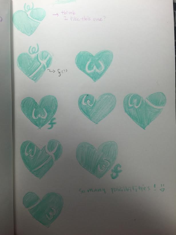
I started the project by researching logos. I went on sites like Dribbble and Pinterest and looked for inspiration. I quite liked logos that had a combination of an interesting shape and the company name. The founders were happy with the direction, and I came up with two options: 1) a heart shape - WeFinance is about happiness and helping each other, and a heart embodies the spirit of the company. Here are the sketches/early prototype I shared.
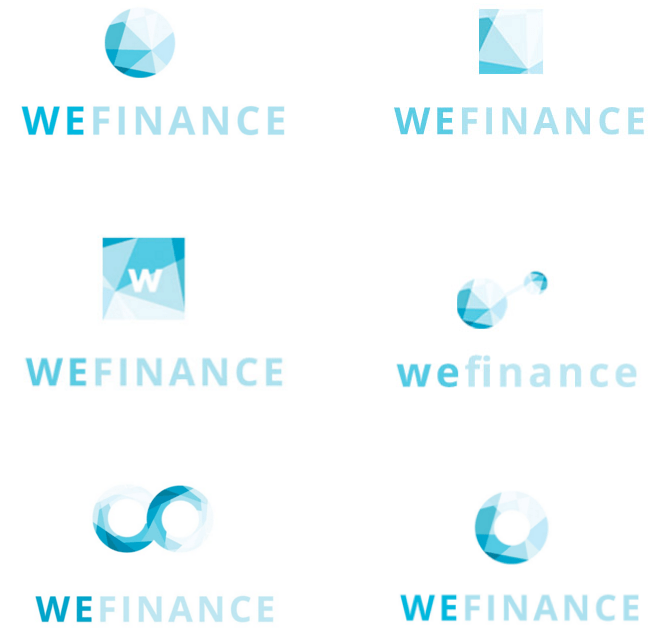
2) a circle shape -- think “circle of connections;” a circle represents the idea that WeFinance connects people. Here’s the prototype I shared.
We ultimately decided to go with Option 2: a circle. While WeFinance is about happiness, we realized a heart tends to conjure up ideas of romantic relationships and dating. On the other hand, the sophisticated feel of Option 2 keeps things more professional, which better matches the personality of the financial services company.
Once we decided on Option 2, I designed new gradients and experimented further.

New gradients ring I designed
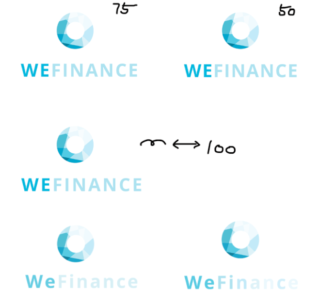
Here are some of the new ideas I tried.
After varying fonts, character spacing, and colors, we found the right combination.
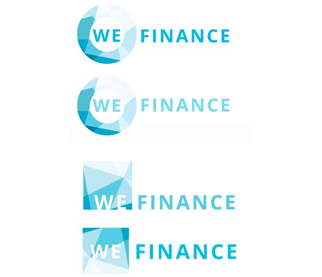
We also looked into integrating the logo into the name more. Based on the insight of one of the founders, we tried emphasizing ‘We’ specifically in their name via the logo.
And we loved the circle around the WE option. The logo is interesting and unique. In addition, it embodies the business model that connects people. And here is the final logo:
I was new to logo design, but am happy with how things went. I designed the logo in just six days and received a lot of positive feedback from the team.
Icon Design
I also designed icons using the gradients I designed for the logo.
Email Newsletter Redesign
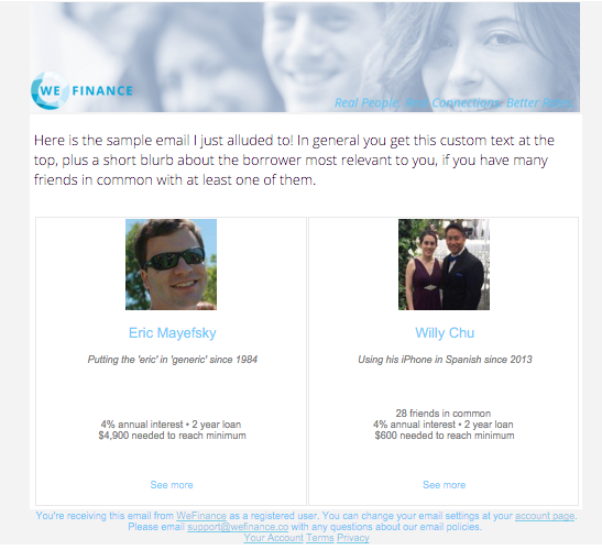
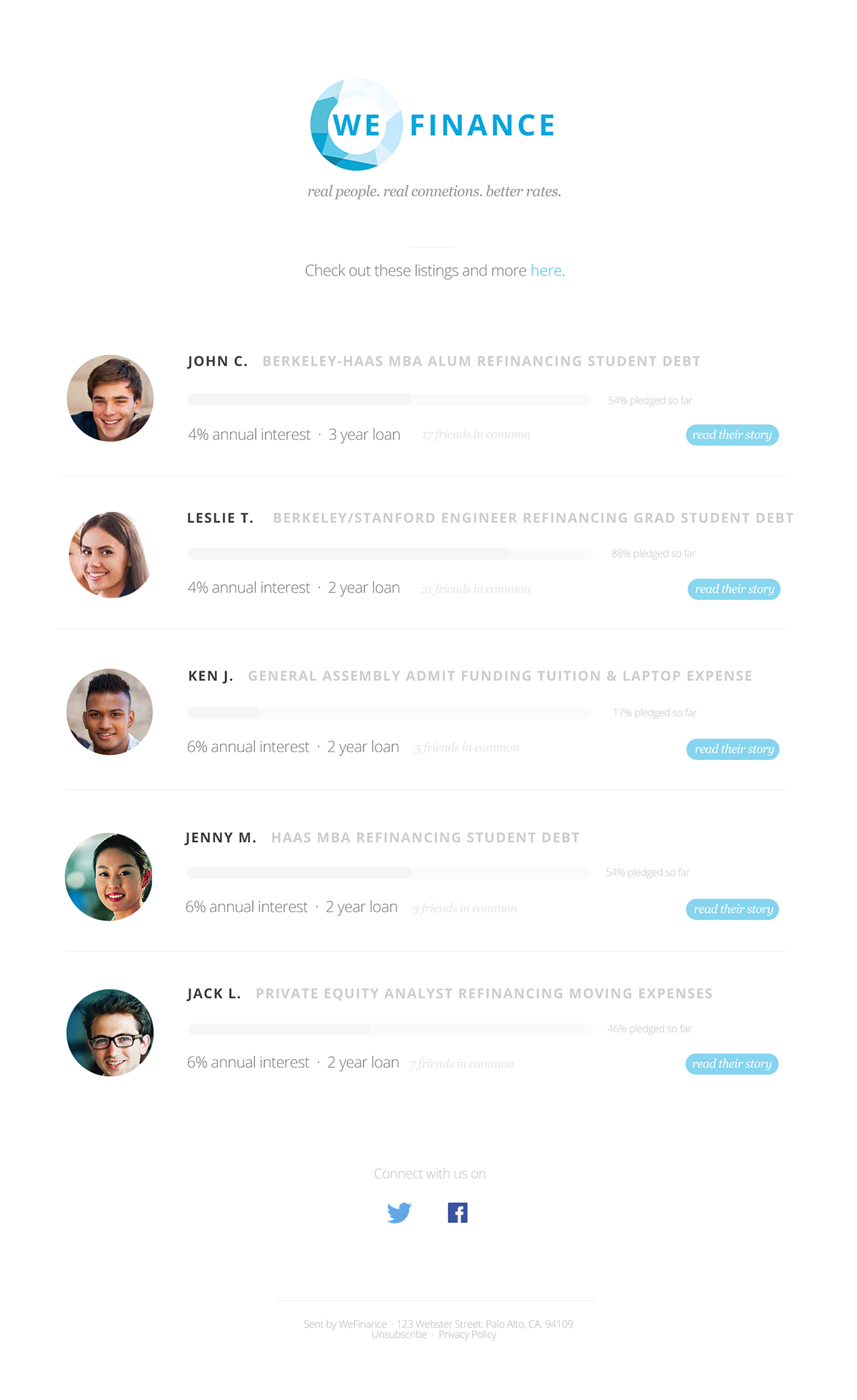
I also worked on an email newsletter redesign proposal. The newsletter, which features borrower profiles, was sent to potential lenders.

WeFinance’s original email newsletter
In designing the newsletter, there were two things I kept in mind.
1) Featuring Strong Calls to Action
The goal of the newsletter is to encourage potential lenders to check out borrowers’ profiles, i.e., clicking the “see more” button. In the previous design, the button didn’t stand out, so I designed a new button that stands out better using colors and shape. Also, I added another call to action - "Check out these listings and more here" - on top of the newsletter.
2) Making the Profiles Interesting to Potential Lenders
I tried to imagine from a potential lender’s perspective, what sort of information would make the lender interested in lending to a borrower. Two things came to my mind. 1) What is the borrower’s story? WeFinance is built around the idea that stories are powerful -- borrowers share their stories - their dreams and aspirations - on their pages, and good stories engage lenders. Given this insight, instead of using generic "see more" in the call to action button, I used "read their story" --it's a small touch, but I think it keeps things a bit more interesting. 2) How much has the borrower raised already? If many people have lent to the borrower already, s/he must be a credible person whom lenders would feel comfortable lending to. Using that insight, I featured a graph bar that allows potential lenders to see how much the borrower has raised in one glance
What I Would’ve Done Differently
There are a couple of things I would consider changing. First, in the current design, I listed one profile per row. However, I want to experiment using columns and listing multiple profiles per row. That way, users view more profiles in a shorter amount of time without having to scroll down too much. Second, since the graph bar takes up space, I want to explore other ways of representing funding information. Lastly, I would increase the overall contrast to make things look more defined.
