Shelterluv

I worked with the PM at Shelterluv to help design the Field Services product. a new product initiative that allows government-based animal shelters to track animal-related law eníorcement work they do in the community.

Timeline
February - May 2021
My Role
Full-stack product design
Team
Product Manager

Advocating for User-Centered Design

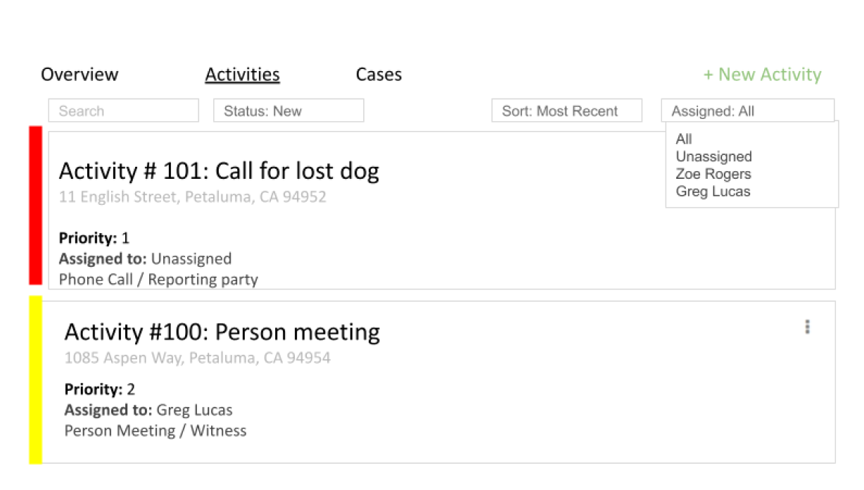
When I joined the project, the PM provided web wireframes for some of the key pages. However, I quickly noted that the wireframes don’t meet critical user needs and that it’s important that we improve the UX if the product were to be successful.
Wireframe I received from the team
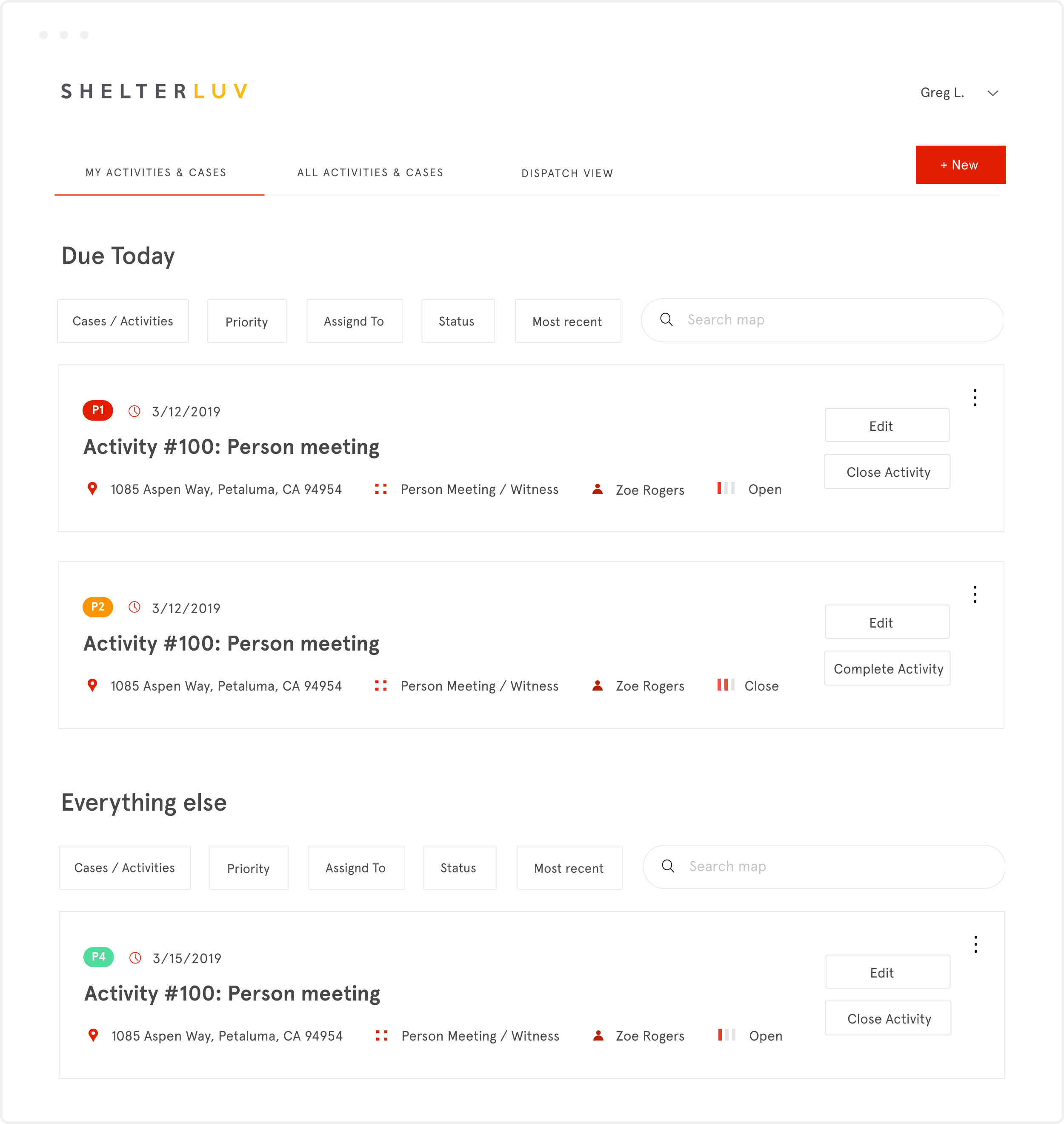
Final designs
Critiques and Redesigns

1. Users Need to Easily Track Their Work

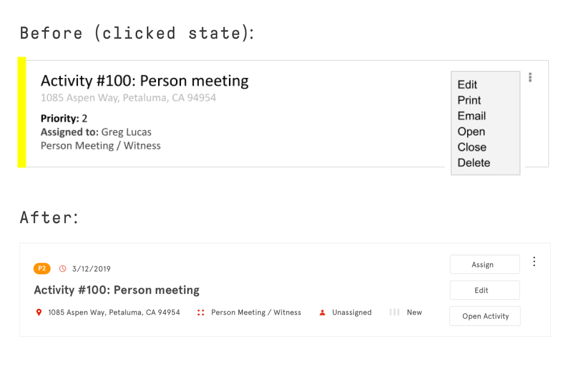
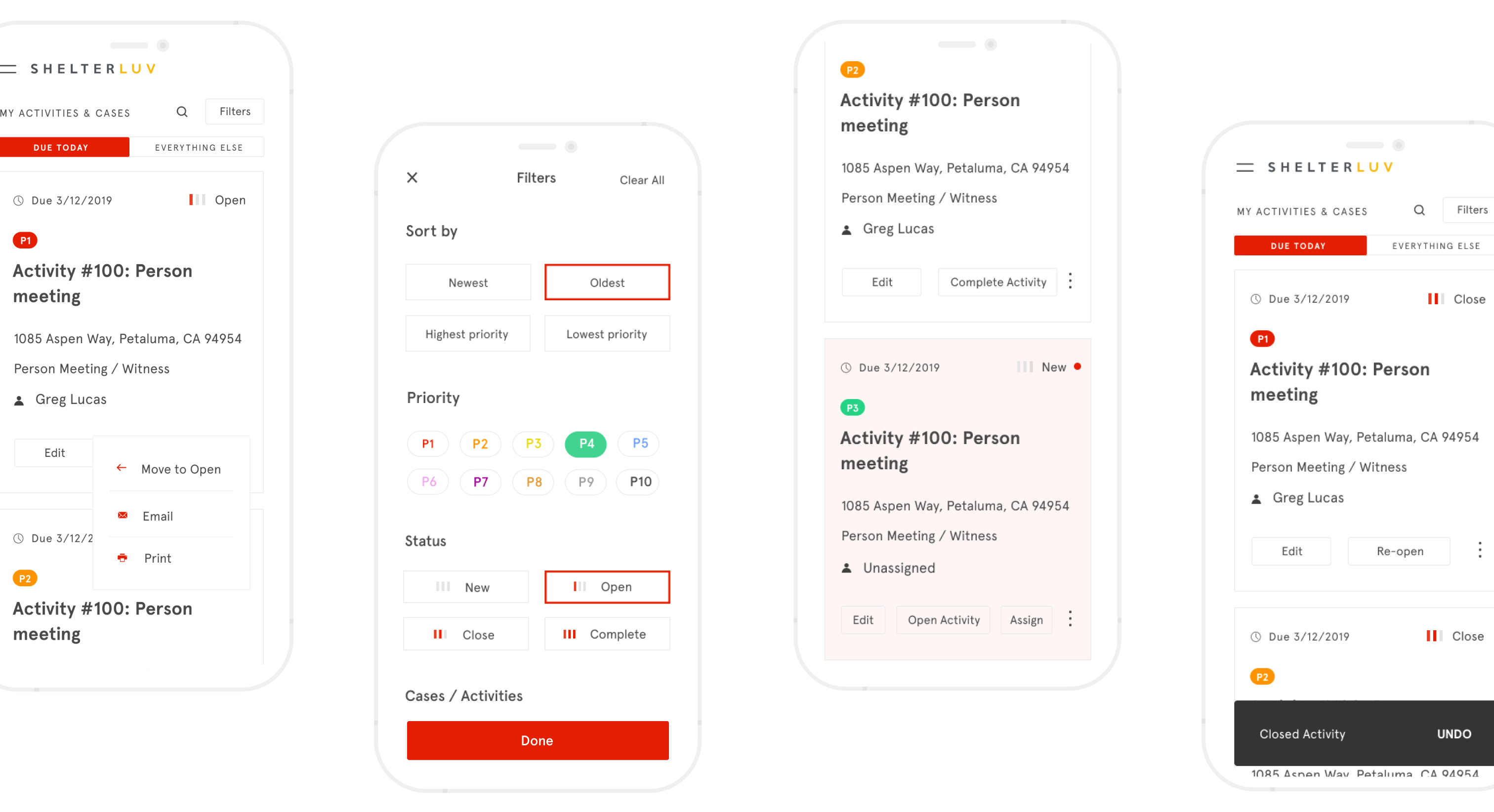
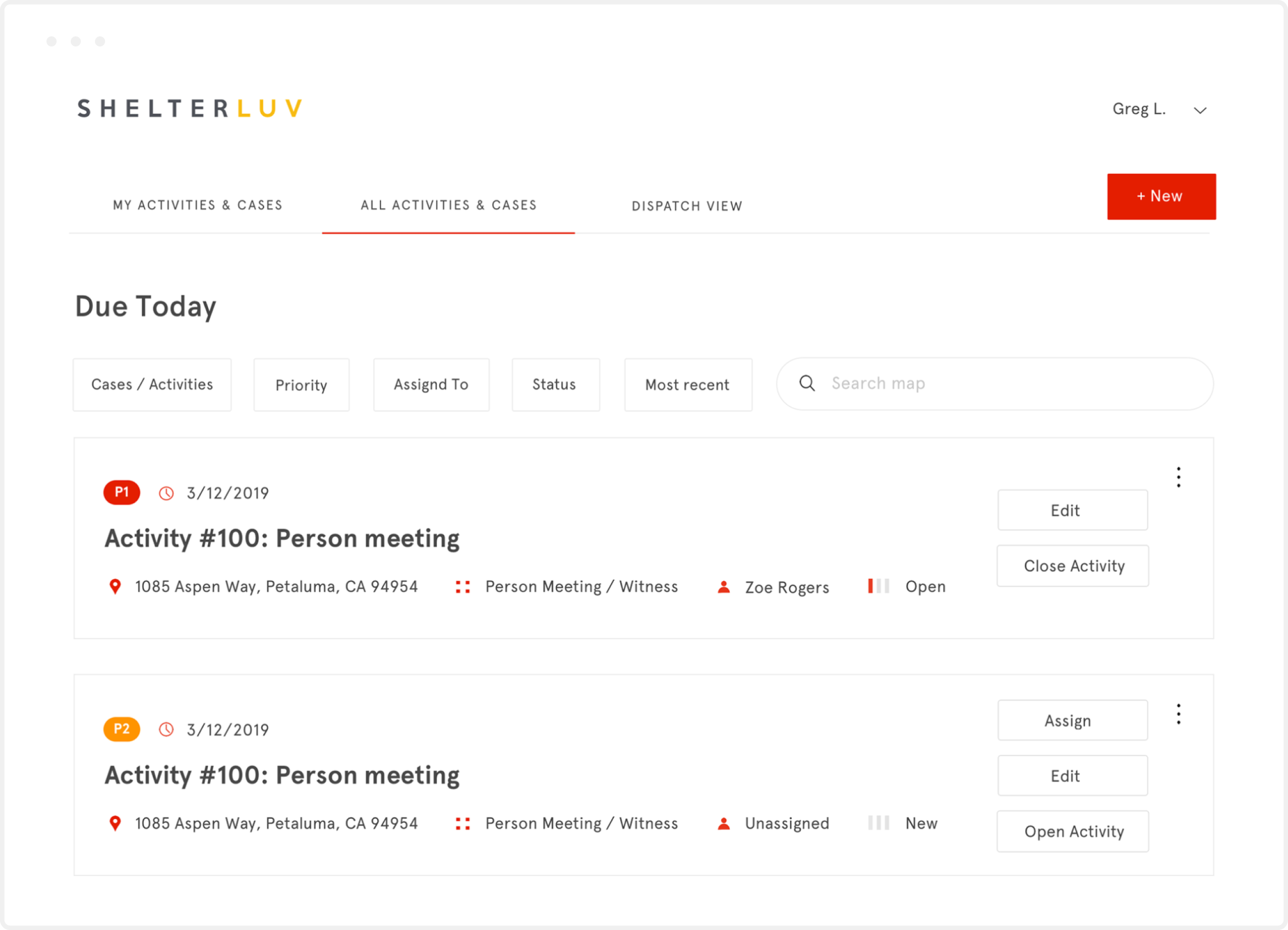
Users (officers resolving animal-related incidents in the community) couldn’t efficiently track their work because users couldn’t easily update information on cards. New designs enable users to easily take key actions on cards (less important actions are hidden under the more icon on top right).

2. Users Need to Easily Review Assigned Work

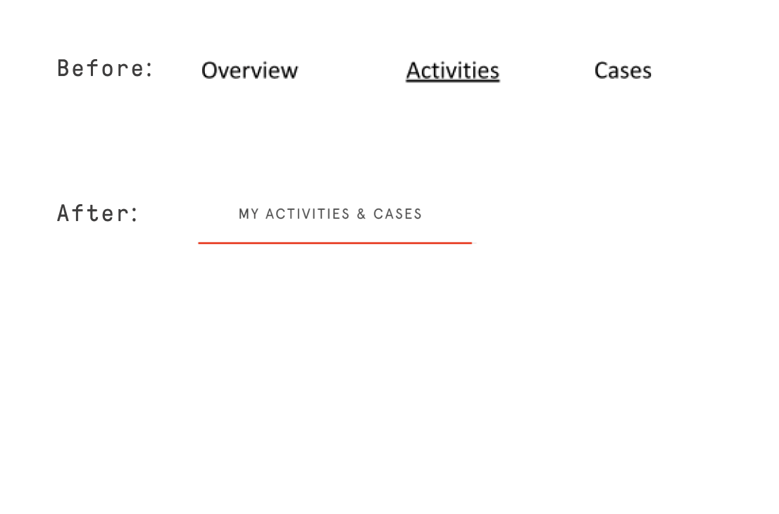
Users couldn’t efficiently review their assigned work because the tab menu separates Activities and Cases. From an officer’s point of view, it’s not so important whether an incident is classified as an Activity or a Case (this distinction exists for legal purposes). What matters to them is that they can quickly review their work, so the new designs merge the Activities and Cases tabs.

3. Users Need to Easily Understand Critical Info

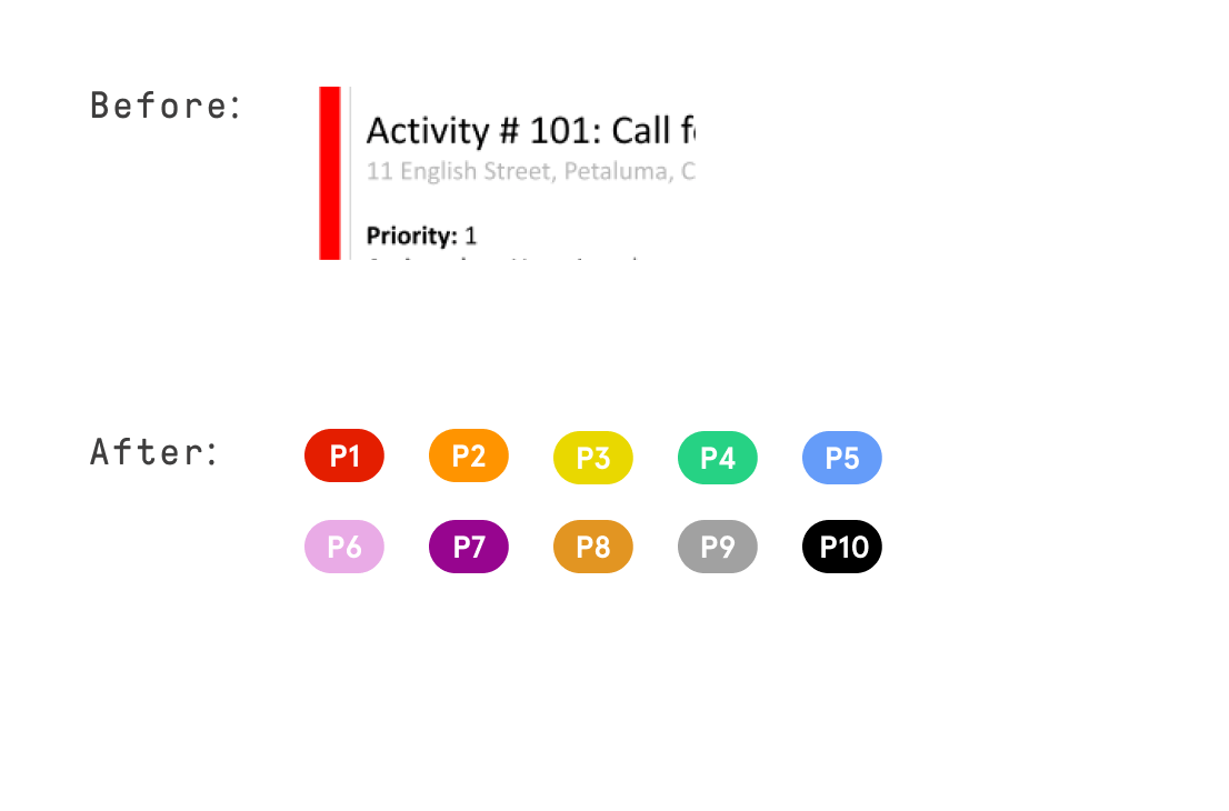
Users couldn’t easily understand Priority Level, a piece of information that user research showed us to be critical to users. Priority Level consisted of the vertical color strip on the left side of the card and text info (e.g. Priority: 1) on the card, but the new designs merge the two so that users can readily understand the information.

4. Both Individual Users and the Organization Need to Easily Review Workflow

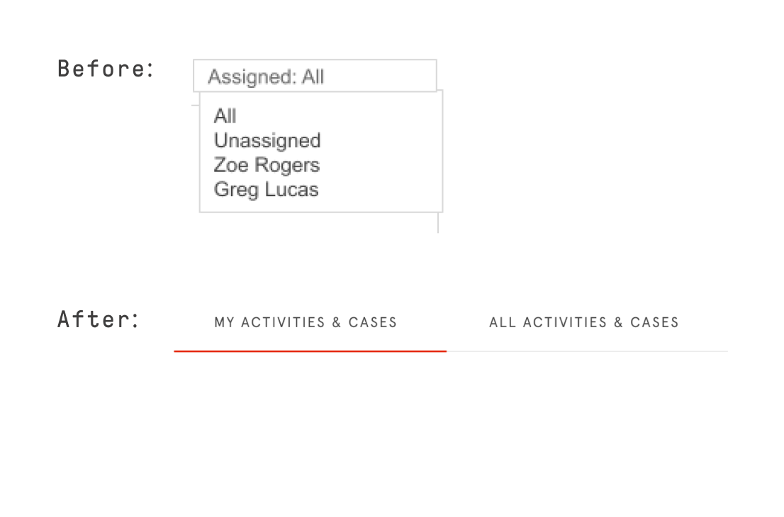
The Assigned to filter on top right complicates workflow for an individual officer since they need to click their name to start reviewing assigned work. Further, the organization as a whole needs to be able to easily review workflow for all officers, so I felt it was necessary that we revamp the designs to cater to the needs of both individual users’ and the organization.

Design Process

1. Taking a Mobile-First Design Approach
Once I shared UX feedback on the web wireframes, I started prototyping mobile designs. It was important that the product be mobile-friendly since users will often be using the product on mobile while doing fieldwork, so crafting solutions for mobile then adapting the designs to the web made sense.

2. Considering Shifting User Needs
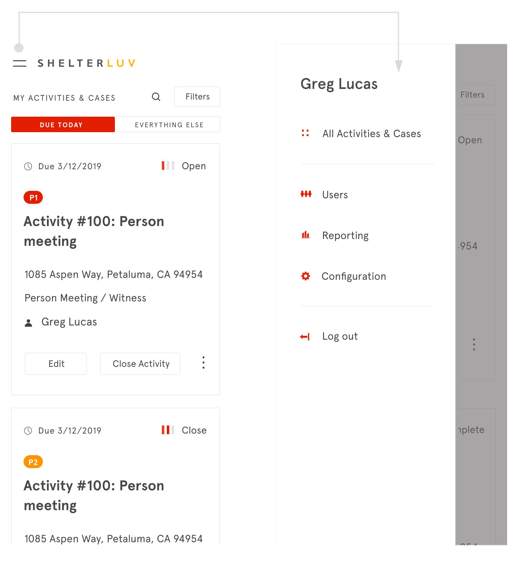
Mobile homepage
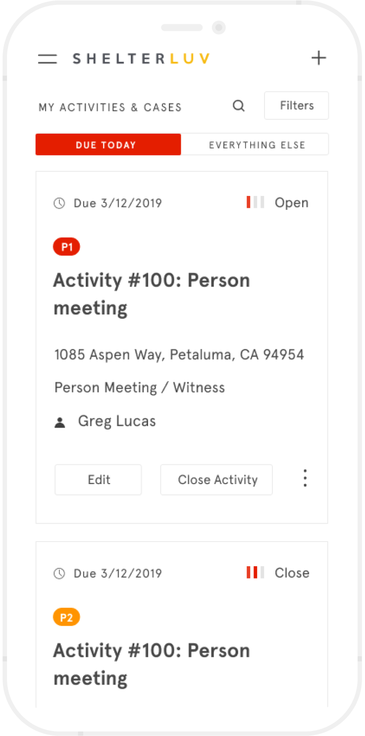
Mobile Homepage
in designing the mobile product, I kept in mind that users often depend on the mobile product to keep track of their own assigned work while in the field. Hence, the designs immediately present today’s to-do list once users open the app — and the list is organized in the order of priority so it’s extremely easy to review workflow, and users can easily update information on cards.
Web designs
In designing the web product, however, I noted that while an individual officer may well want to review their workflow on the web, it’s also likely that the organization as a whole, including dispatch officers who assign work, will want to review workflow at the organization level. Keeping organizational needs in mind, I designed the web product so that users have easier access to All Activities & Cases.
In the mobile product, All Activities & Cases is in the hamburger menu and made less prominent, though still accessible.
3. Lovin' Collaborating
I built on others’ ideas, which pushed me to create more creative solutions. For example, the PM liked the idea of putting the status information on top right of the card because of easy discoverability. I liked this direction too, and started exploring visualizing information so that it becomes even easier for users to register status information at a glance.

Status visualization prototypes

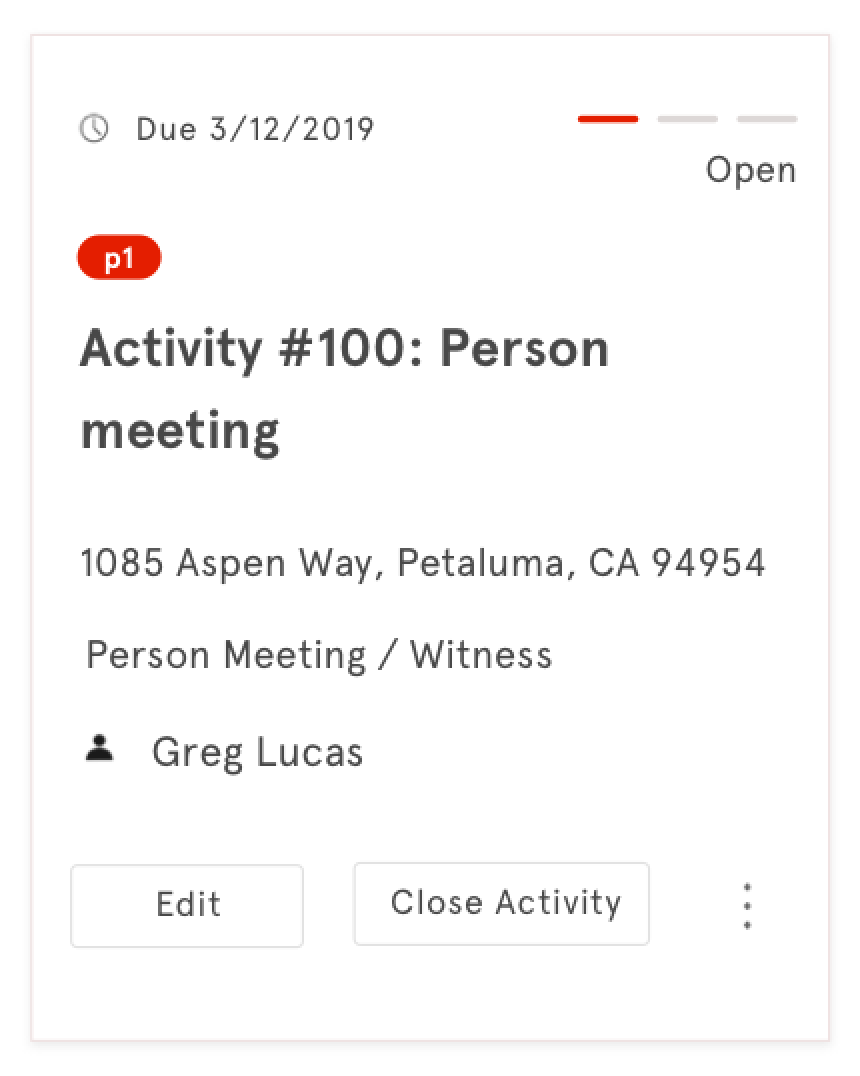
After prototyping, I came up with mini progress bar icons, which help create a coherent user experience because they go well with the other icons used in the web cards. Furthermore, these icons were not only received well by the users but also straightforward to implement from a technical standpoint.
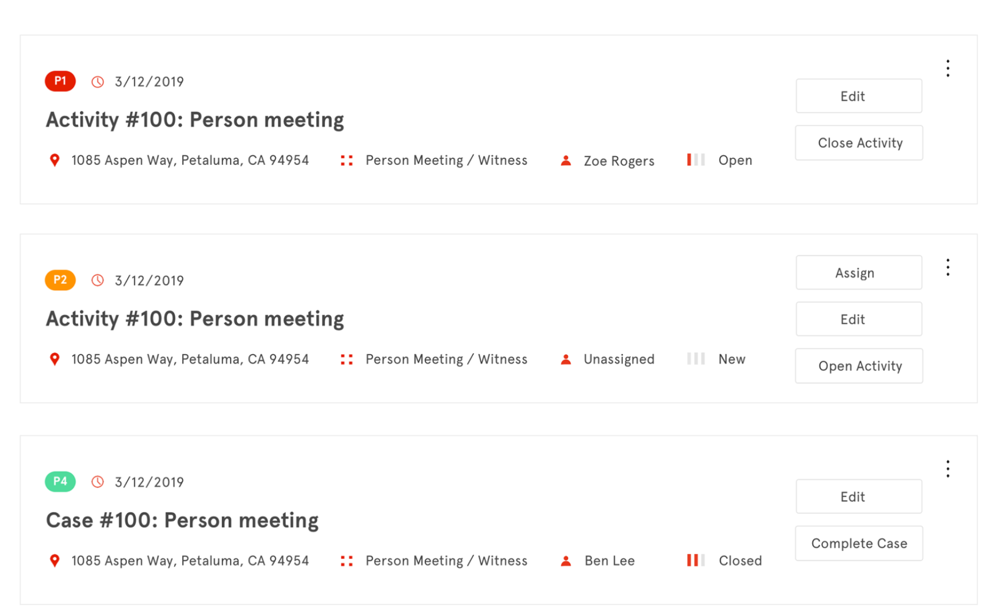
Status visualization final designs
4. Iterating, iterating...
a. Testing Designs Even When Not Ready
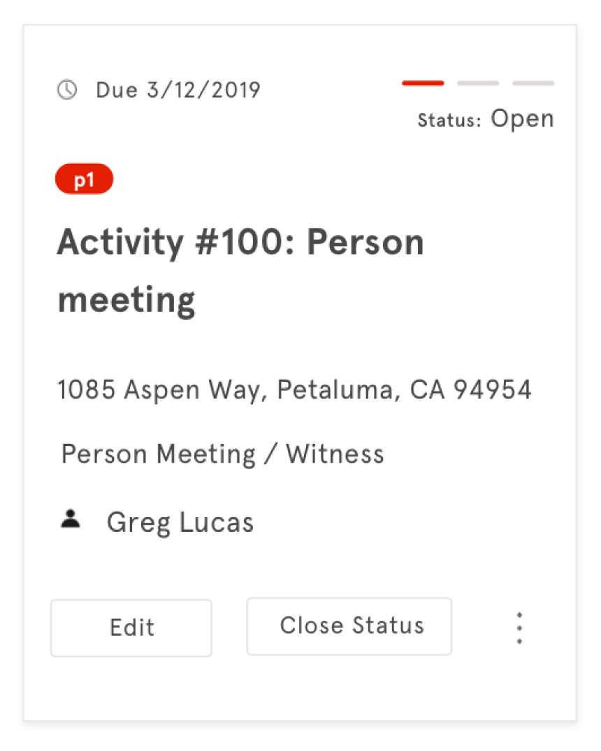
While we liked the idea of keeping things simple by not using column headers on cards, we tested prototypes with users to clear any doubts we had (in fact, I thought not using labels for status might leave users confused).
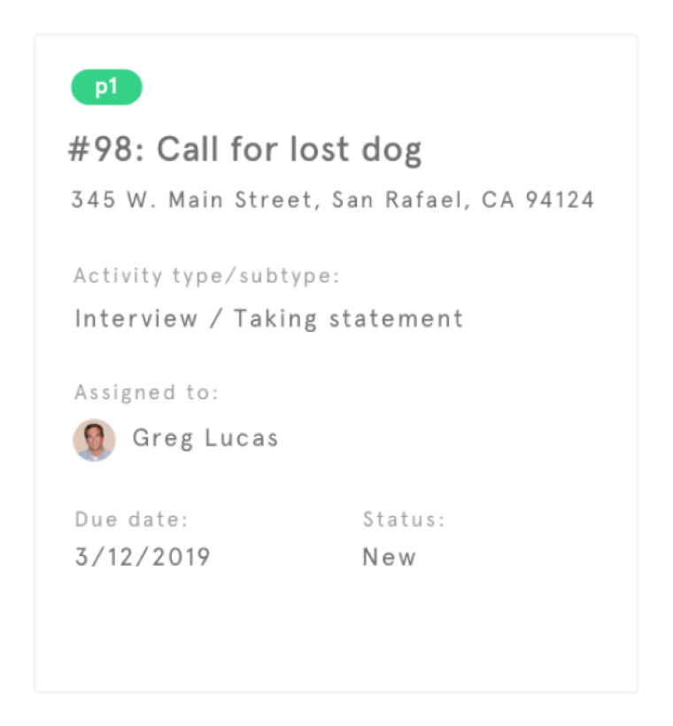
Column headers used on cards
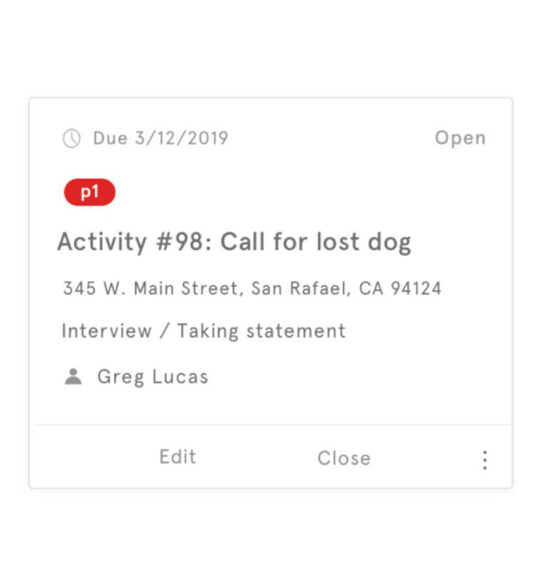
Column headers not used on cards

During this process, I took the initiative to test other things that we can test at this stage. For example, while we hadn’t worked on screens other than the homepage, I put together a clickable prototype that linked the homepage to rough prototypes of other key pages so that we could test whether users are able to accurately take key actions on the homepage. It’s better to fail early and course- correct than wait until you have full designs ready, so I felt that it was the right call to test additional features at that point.
b. Improving Usability
In other rounds of testing, we improved usability based on feedback. For example, we found that filters on the web had a usability issue and we moved the checkboxes to the left of selections so that it’s clearer to users what selections they’re making.
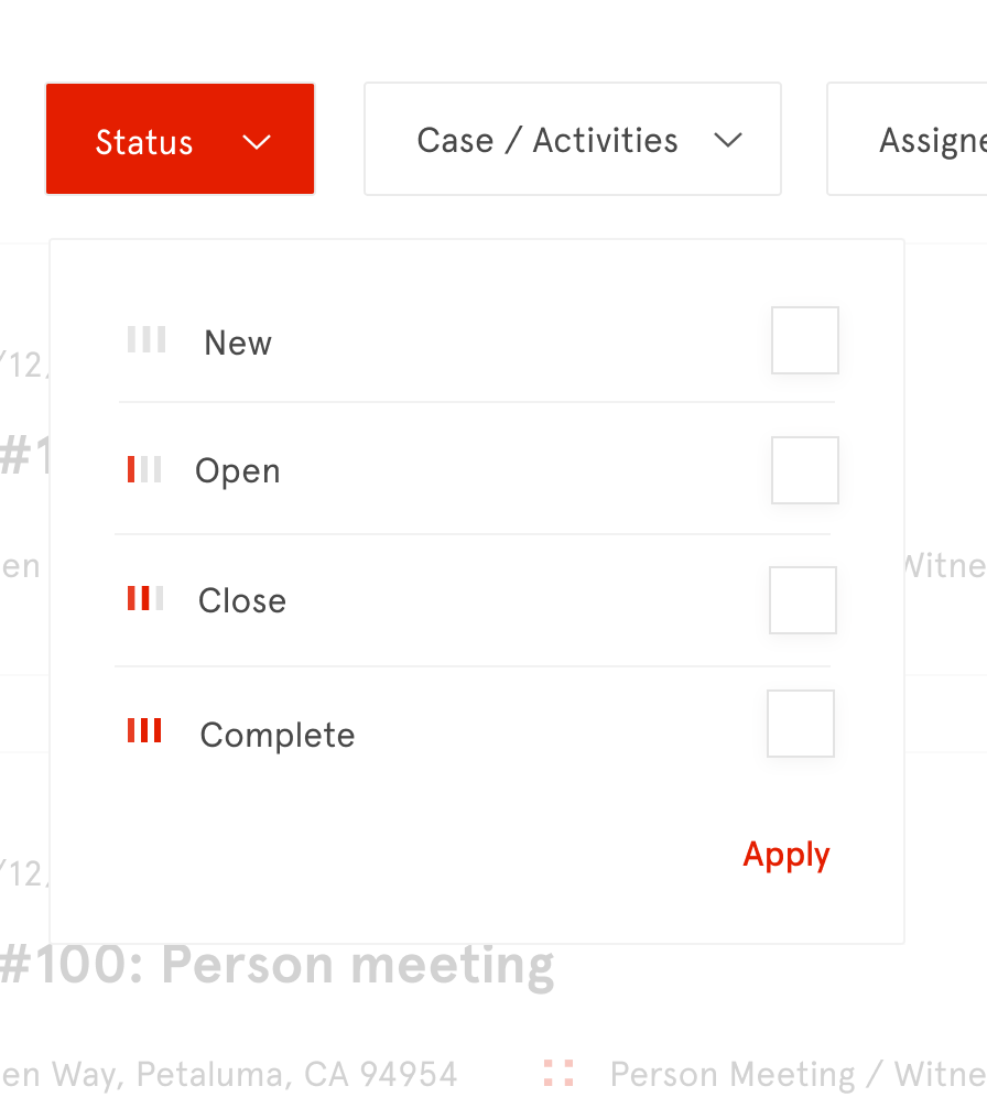
Before
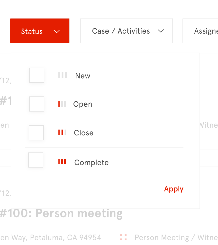
After

5. Leading the Design Process with UX Research Insights
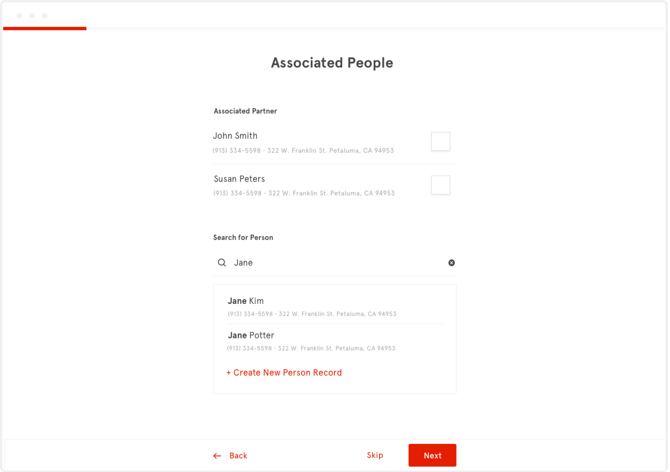
I reviewed research on UX as I designed and shared UX research insights with the team in order to effectively guide the design process. For example, the form wireframes that the team originally created had usability issues. To quickly get buy-in, I shared key research insights with the team.
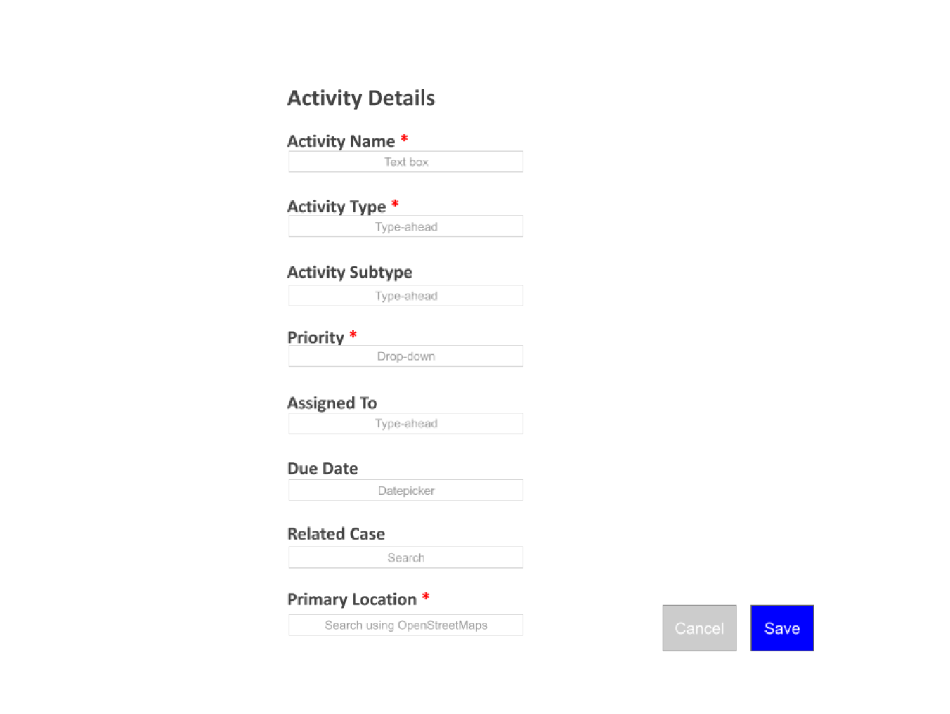
Form wireframe had usability issues
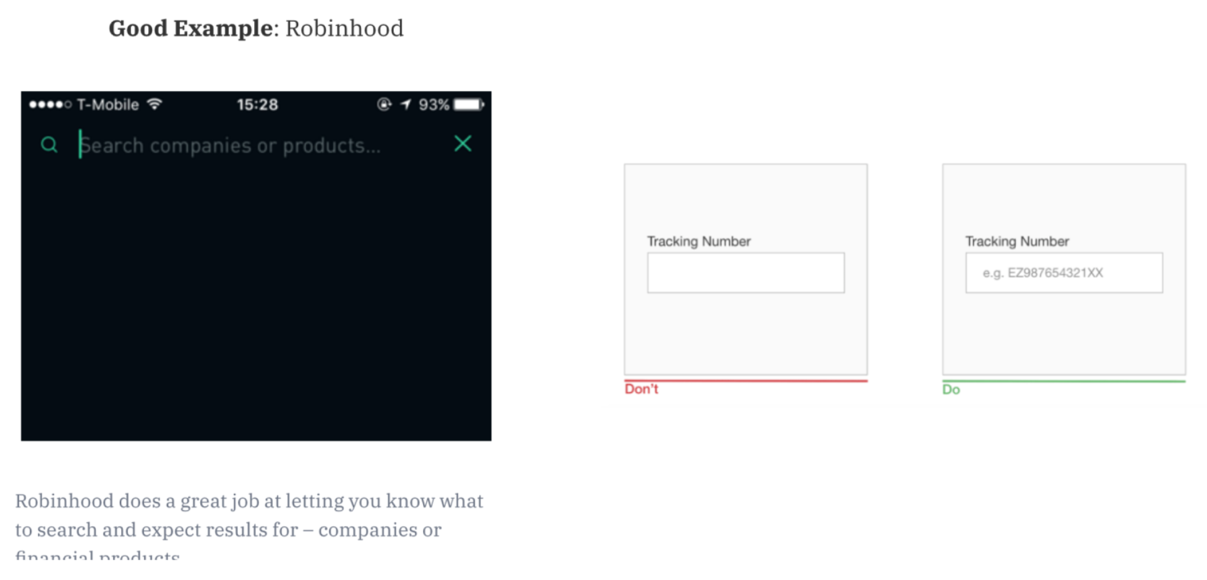
Some of the UX research insights I shared with the team
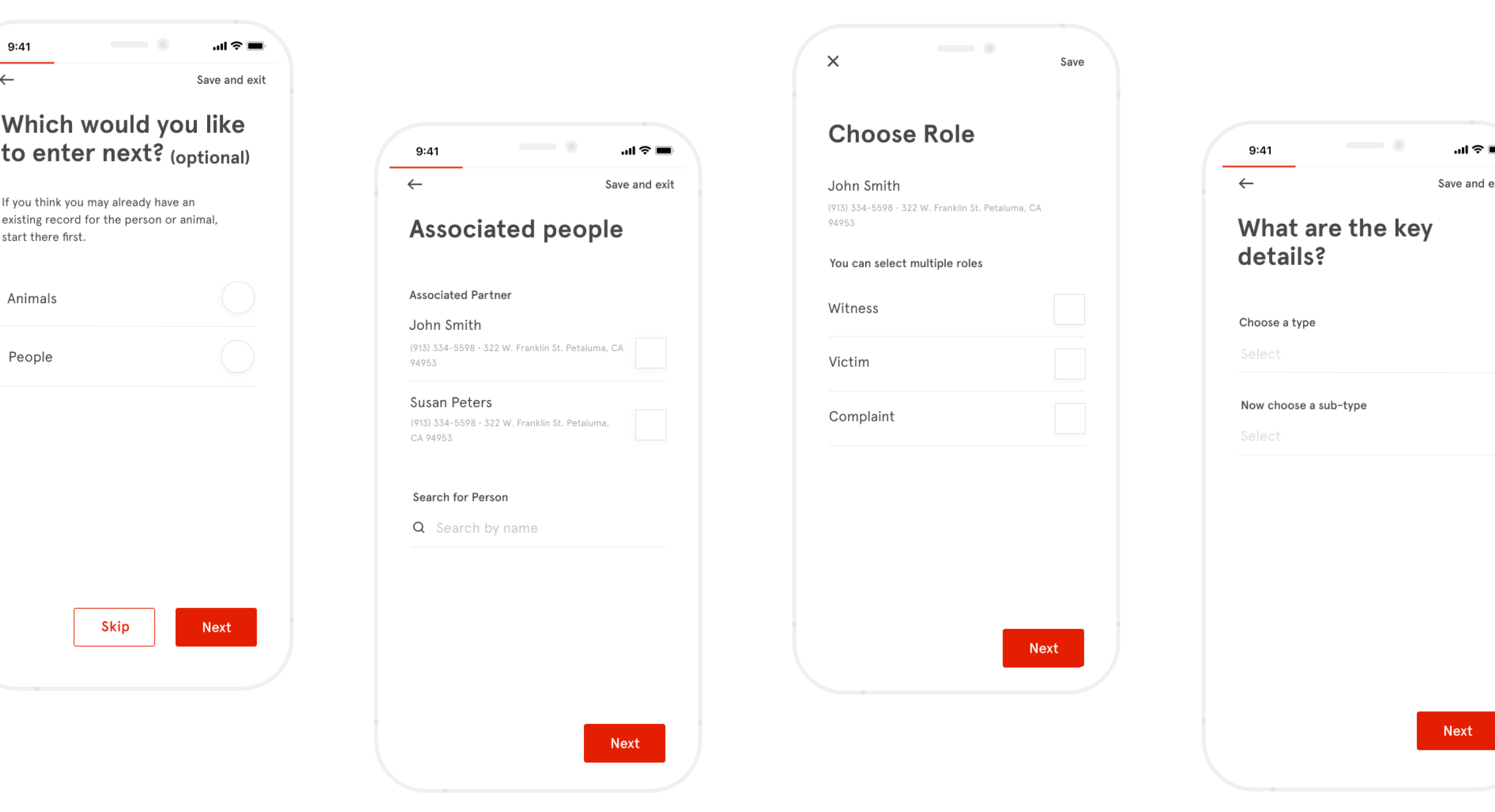
Final mobile form designs
Final web form designs

What I Would've Done Differently

I’d revisit UI elements. First, I’d reduce whitespace on cards on mobile so that users could review more cards as they scroll down. Second, I’d revisit icon designs on mobile cards. We kept the person icon for the assigned info since we thought that might help people more easily digest information as a whole, but I’d explore other ways to represent information (e.g. using labels) so that information flows a bit better.