User Needs
A Pew study confirms that Facebook is by far the top news source for political news among millennials. I think millennials like to read posts Facebook friends shared because first, they come from trustworthy sources, i.e., my intelligent friends and second, the discussions that happen in the comments section are often interesting.
“Sometimes I’m more interested in reading the news than personal updates”
However, the Newsfeed is often filled with content you are not interested in consuming. As my friend commented, “Sometimes I’m more interested in reading the news than personal updates,” users sometimes want their Newsfeed experience to be simplified. The product fulfills such user needs by presenting only what they are looking for. In addition, people do not always check Facebook and as a result, they sometimes miss articles. The product allows people to read news that they would otherwise have missed.
Design Goal: To Deliver a Great Reading Experience
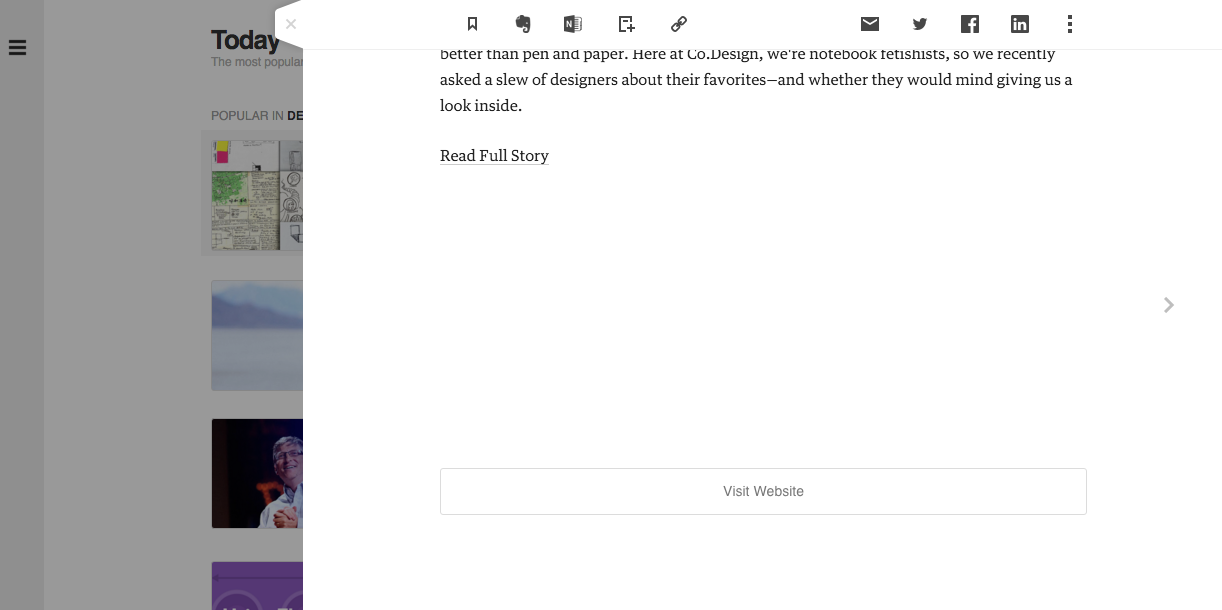
One key design goal I had in mind was to deliver a great reading experience. I think web-based news readers can do a better job at delivering a pleasant reading experience. For example, Feedly, one of the most popular RSS readers, offers only a preview of an article. To read the whole article, users have to first click the news item on their feed on Feedly and then click either the "Read Full Story" link or title. It'd be nice if users could view the whole article with just one click instead.

Feedly offers only a preview of an article
On Flipboard, another popular newsreader, users are instead directed straight to the original site when they click the news item. However, the web is often less ideal for reading. Large ads, bad layouts, and other features on news sites can distract you from reading. I think the popularity of products such as Readability, Pocket, Instapaper, and Medium really speaks to the idea that users value distraction-free reading experience. Given this insight, I think a news reader that also parses articles and presents them in a clean format will offer extra value to users. This way, users can enjoy a great reading experience without having to leave the site.
Design Details
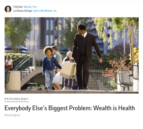
For the interface, I wanted to have as few elements as possible so that the product offers a distraction-free reading experience. For example, I think the pictures that news readers pull up for each article are often irrelevant to the articles. Hence, I decided not to pull up photos for each news item and present only the essentials.

Pictures don't always make sense
Iterations
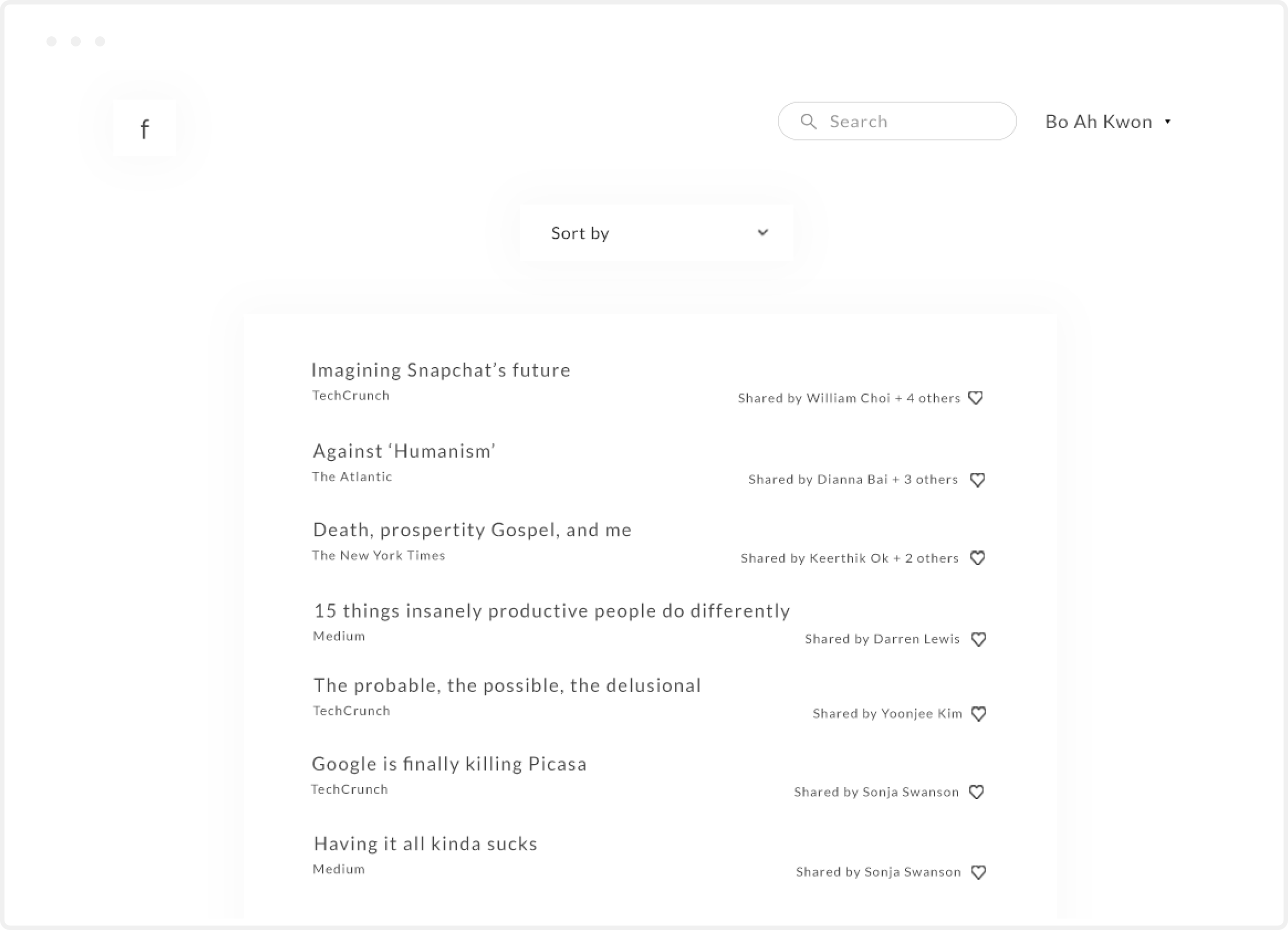
After designing high-fidelity mockups, I shared an InVision prototype with potential users. One useful insight I gained while talking to users was that they are not just interested in who shares the article but how many people are sharing the article. This makes sense because the more widely an article is shared, the more likely it is interesting. In my original design, the product sorts the list by most recent.

The original design sorts the article list by most recent.
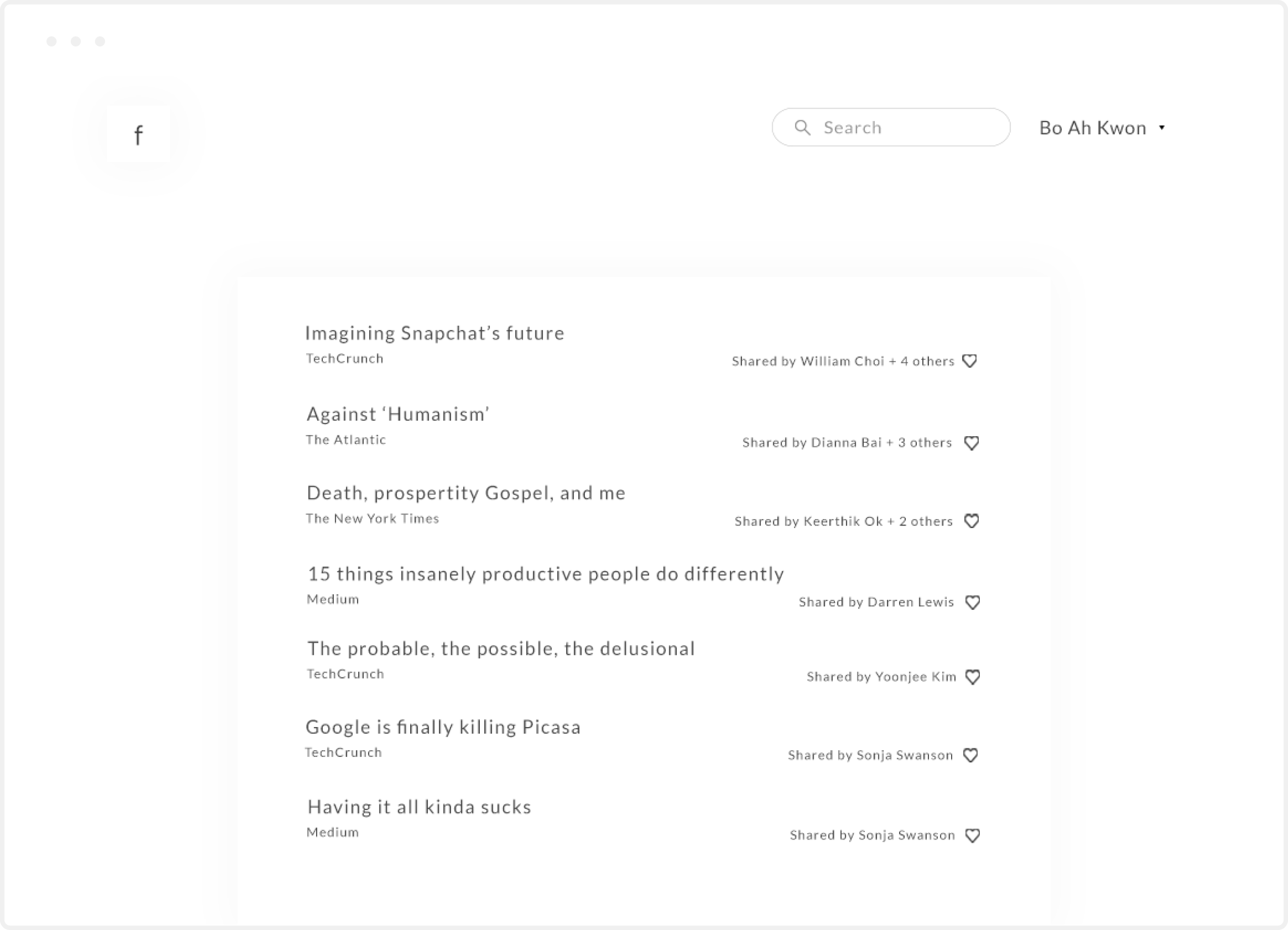
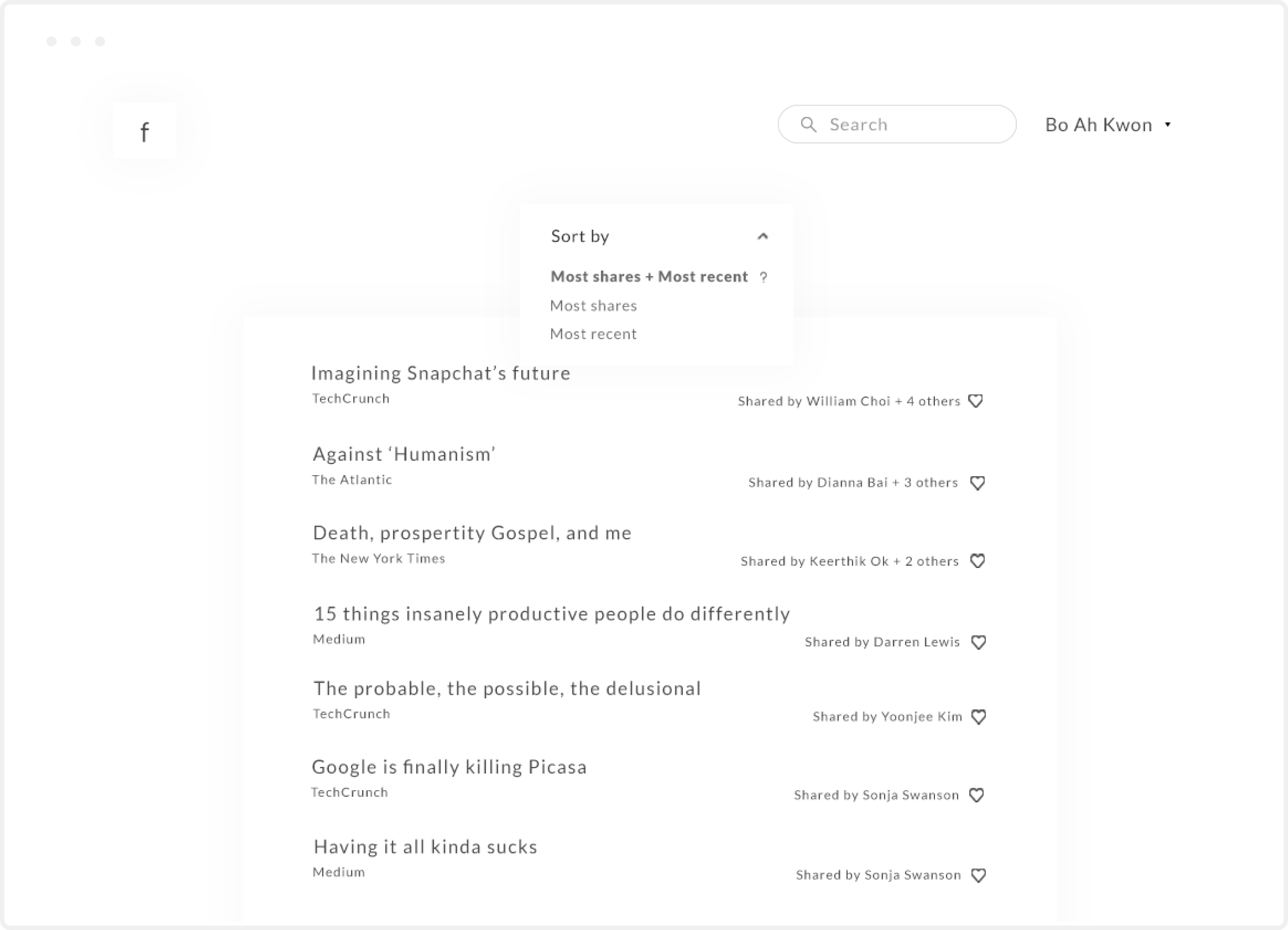
However, users will appreciate being able to sort the article list by most shares. So I decided to give users options to sort the list by a) most recent b) most shares c) a combination of a ) and b). I thought c) made sense and made it as the default option. In this option, articles that were shared the most - but relatively recently - appear on top of the list, then the list sorts the list by most recent. For example, an article that was shared by many but shared a long time ago will not make it to the top of the list. Here's the new article list page.
There were other useful insights I gained while talking to users. For example, some wanted to be able to sort the list by topics e.g. politics. However, the goal of the product is to simplify the Newsfeed experience after all, and I decided not to add more bells and whistles.
Final Design
A user logs in.
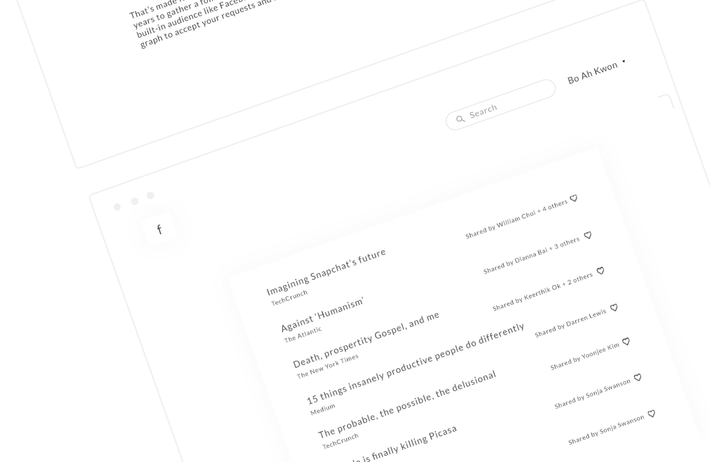
S/he sees the list of articles that his/her Facebook friends posted.
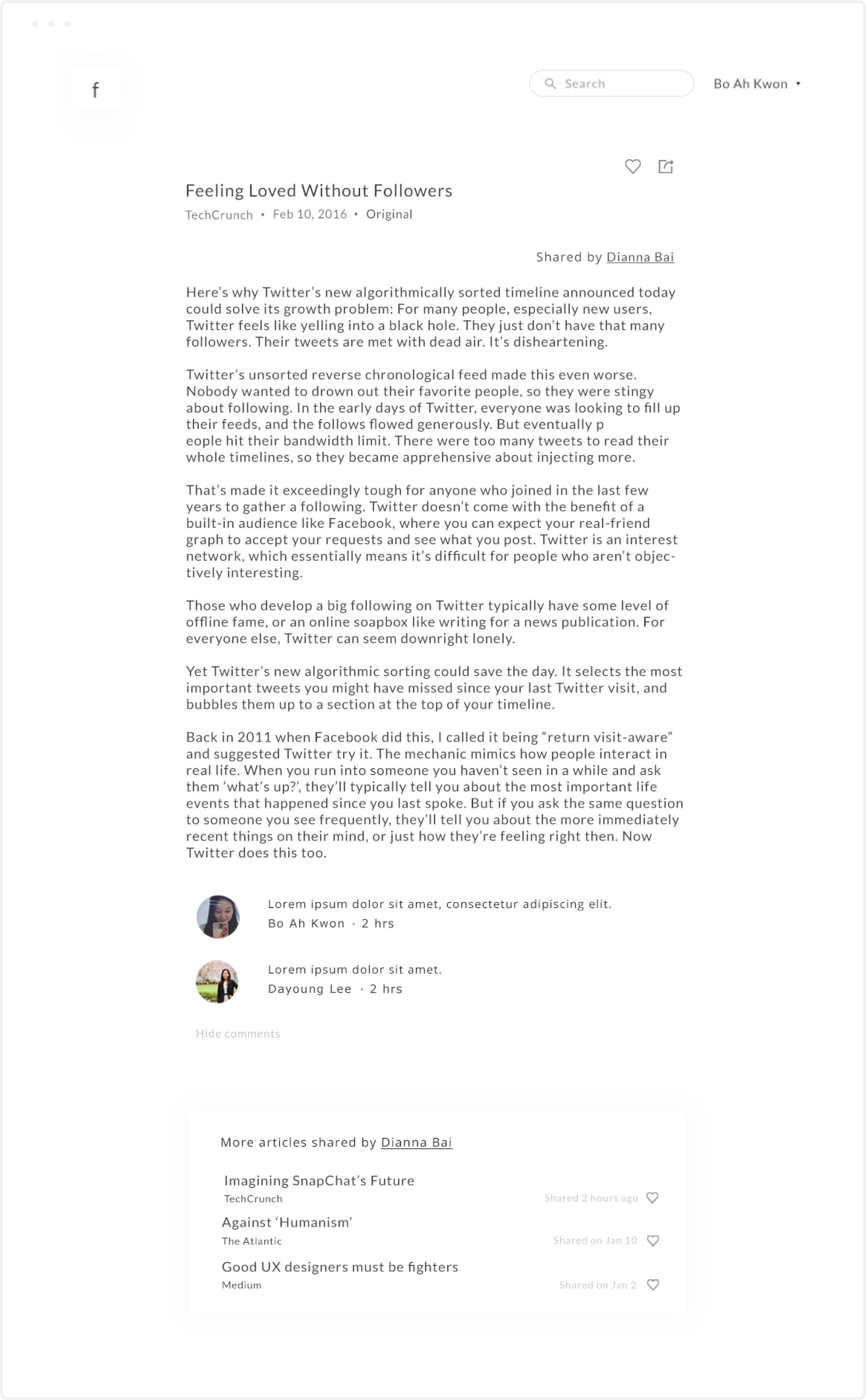
S/he reads an article distraction-free. The site also pulls comments from Facebook, which s/he can choose to hide.
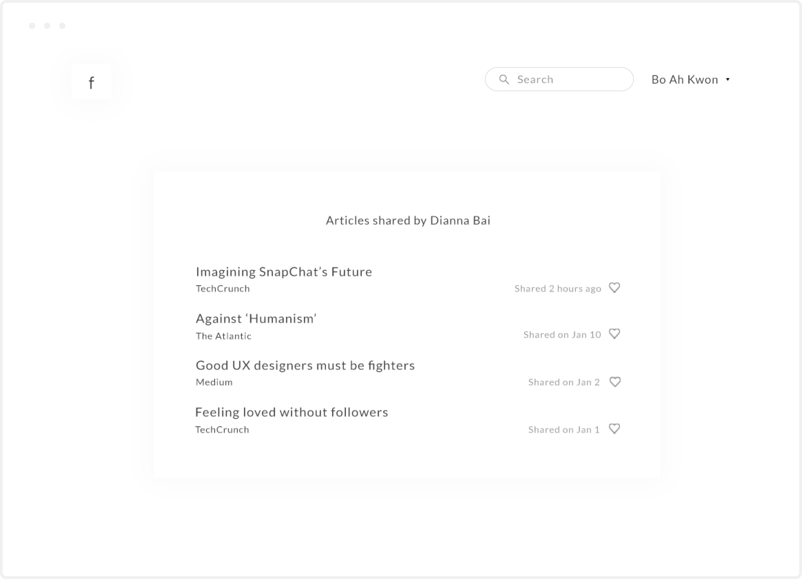
S/he can also view the list of articles posted by a specific friend.
What I Would’ve Done Differently
I recognize that it may be a challenge technically and legally to implement the product concept. I would've liked to look into relevant areas further to validate the product concept.
