The Challenges
1. Designing With Technical Constraints
When I joined the project, the company had already chosen a CMS platform. The platform’s designs, however, didn’t provide an optimal user experience. The company’s engineering team wasn’t available for this project, and without their support I was challenged to think creatively as to how to design given the constraints.
2. Rethinking Content
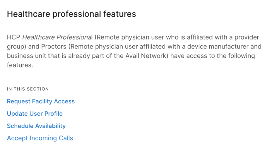
The 100-page IFU on which the eIFU was to be based didn’t present content clearly. Avail’s product operates in a very complex ecosystem — there are multiple user groups and subgroups and each group has access to different features and devices. To create a great experience for different users, I was challenged to completely rethink how to present content.
Uncovering Unmet User Needs
With these challenges in mind, I started reviewing information on the product and it soon became clear to me that the eIFU has the potential to serve pressing yet unmet user needs. When I asked the team about the UX issues with the current product, I learned that the team is getting a large volume of inquiries from frustrated users who were confused about the UX. A medical company like Avail can’t immediately update designs due to regulations, and I noted that the eIFU can not only serve as an electronic version of the IFU but also help resolve the usability issues that users are encountering until UX designs are updated.
Armed with this insight, I set out to first reorganize content and, second, develop wireframes. In reorganizing content, I started by writing down the list of content each user group needs and the list of questions each group is likely to have, and then refined the lists with the PM. At the same time, I started conducting a thorough review of the IFU content and asked clarifying questions to develop a nuanced understanding of the content. Finally, I developed wireframes, which we iterated multiple times per user feedback.
Designing with Technical Constraints
CSS Re-Writing
Noting that we couldn’t make any structural changes since the engineering team was unavailable, I made use of CSS rewriting to revamp designs.
Example 1: Topic Navigation
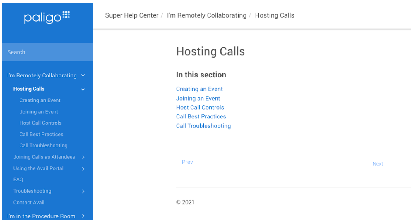
Users aren’t used to using the “Prev” and “Next” buttons on the bottom to navigate through topics. Further, A single column list of text links as buttons aren’t commonplace.
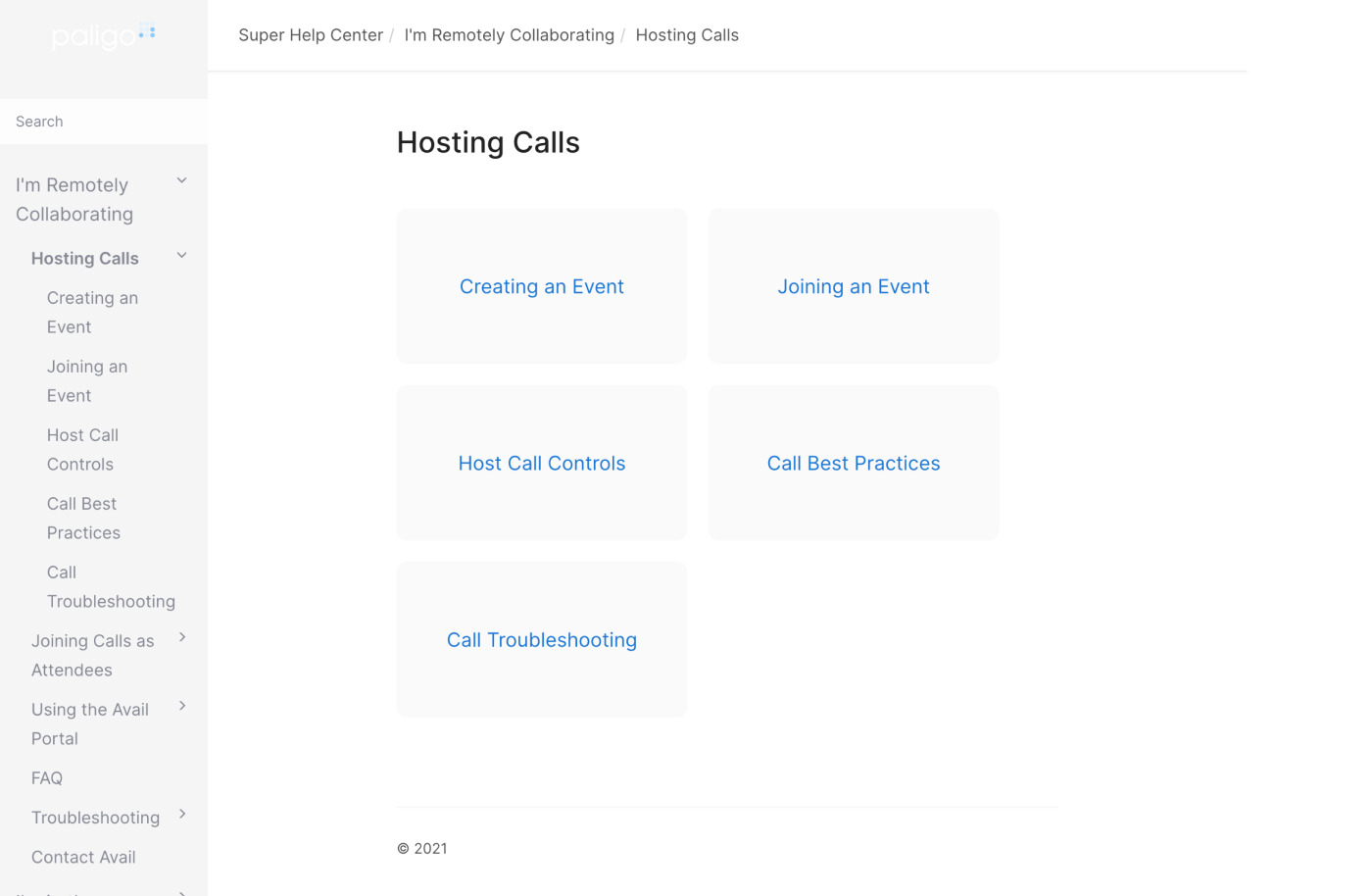
To revamp the designs, I tweaked CSS to present selections in a way that’s familiar to users.
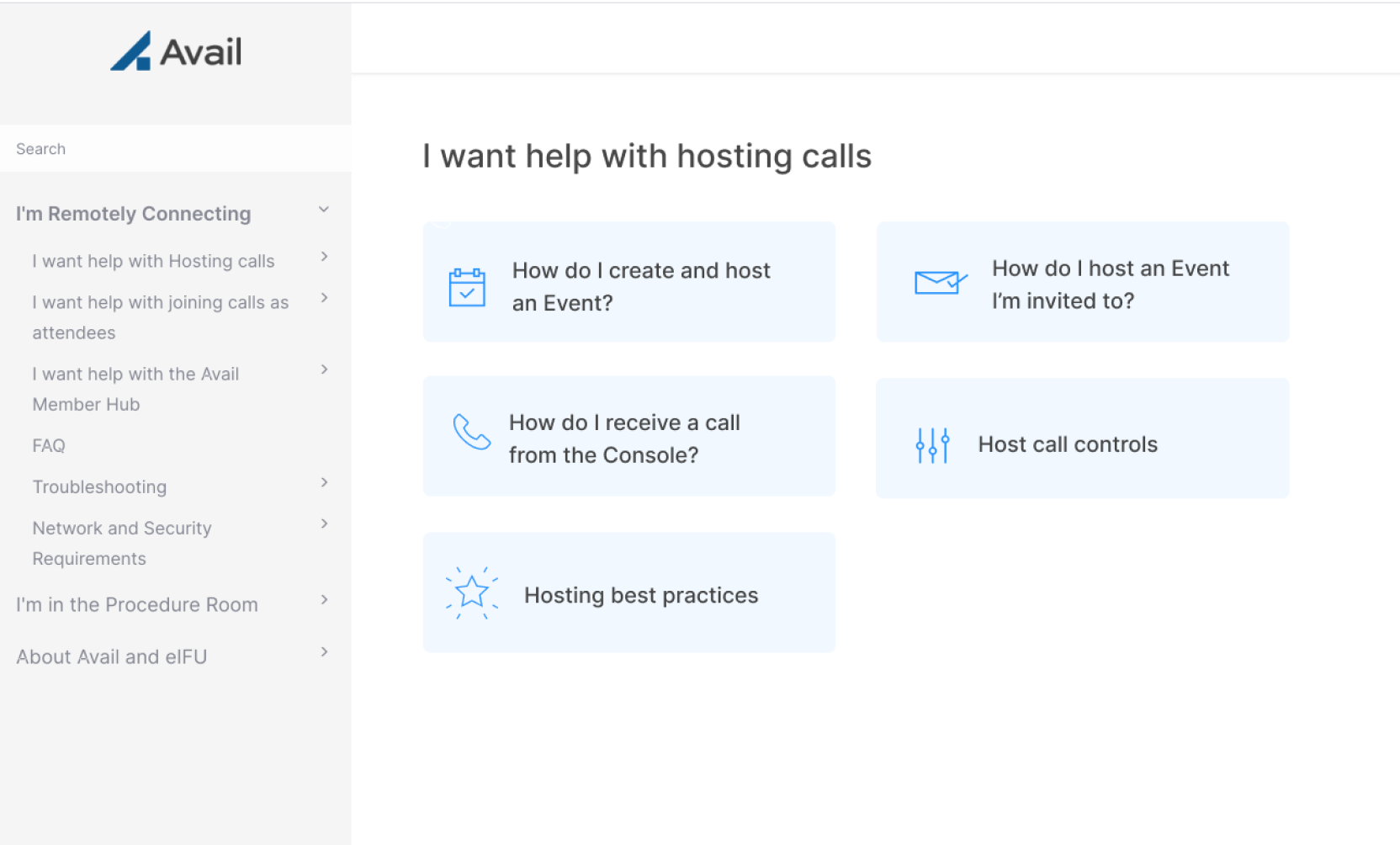
In the final design, I added visual elements like icons and colors to create a more cohesive experience.
Iterations
We learned useful insights from sharing prototypes with users.
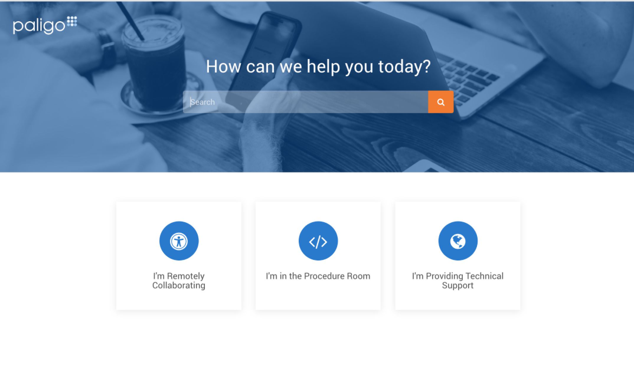
First, while we initially planned to offer content for Avail’s engineers, who provide technical help on-site, too, in the eIFU, we learned it’s better not to since Avail positions itself as a white-glove service provider and it’s best to take care of internal needs in a non client-facing place.

Original eIFU homepage

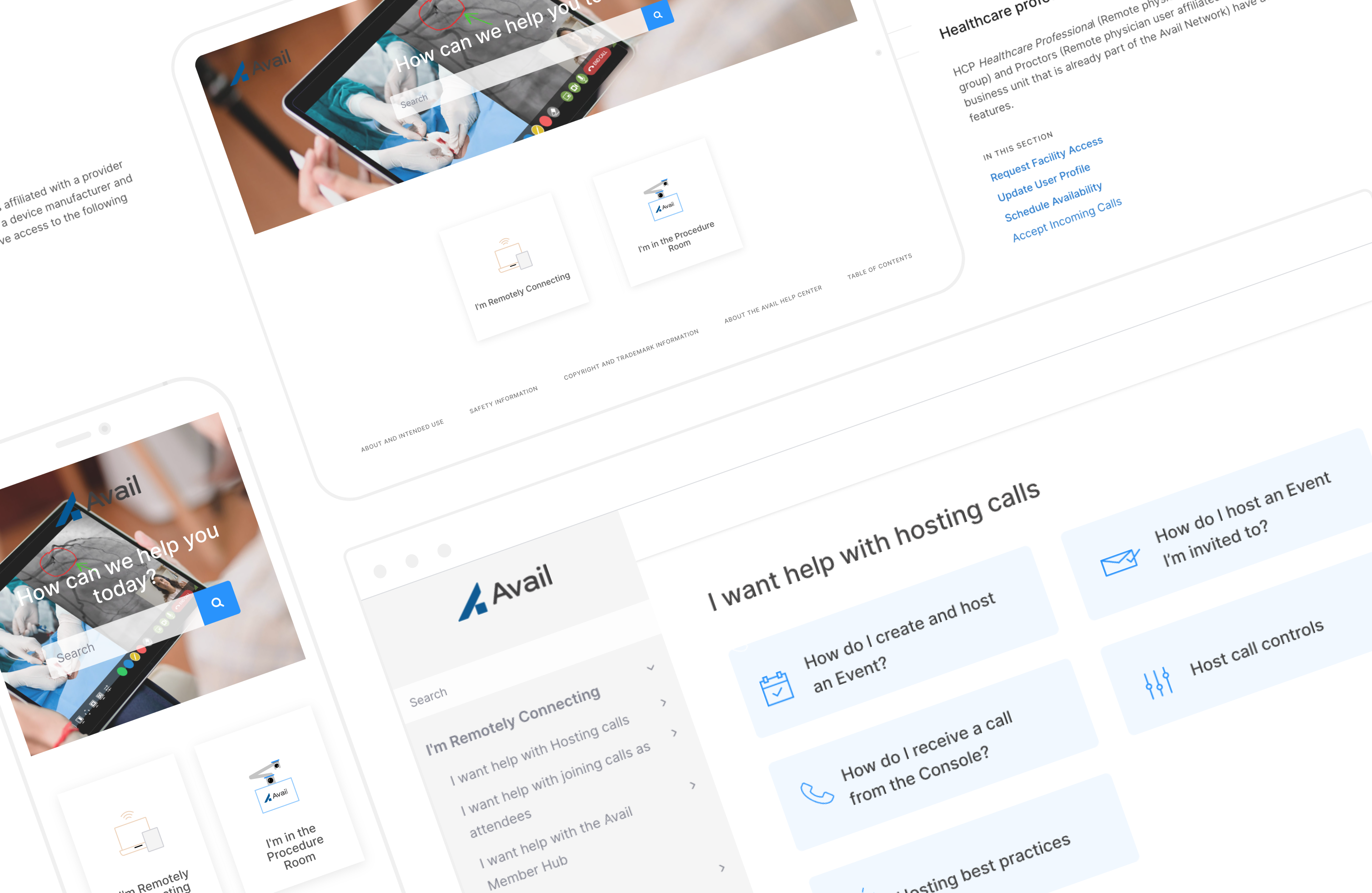
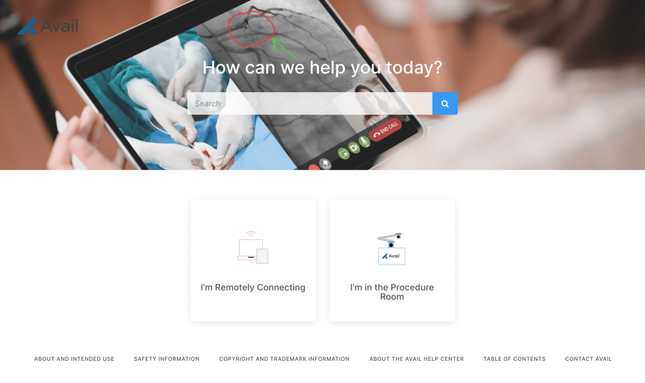
Final live eIFU homepage, where I deleted content for engineers (in addition, I edited CSS to apply Avail’s brand style and designed custom icons and the cover photo)
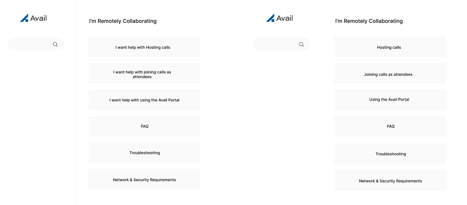
Second, we gathered useful feedback on the tone. Folks found the “I want help with…” tone (vs. simply stating the task) to be friendly and helpful, so we went with that tone.

Testing tone with users
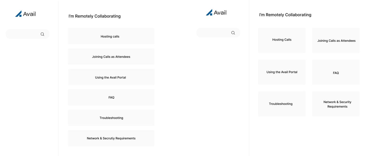
Third, we learned valuable insights on whether to use gridview vs. listview in presenting selections. While I initially leaned towards listview, I soon learned that folks prefer gridview — they thought it looked nicer visually and liked not having to scroll down to review selections. UX research uncovers that listview works better when users are in search mode (and rely primarily on reading the text to make selections) and gridview works better when in browse mode (and rely on images to make selections). While our users are in search mode, I felt that user testers made a valid point — listview, in our case, forces users to scroll down to view selections and we went with gridview.

Testing gridview vs. listview with users
What I’ve Learned
Going in, I wasn’t aware that technical skills would be necessary on this project.
However, my familiarity with basic front-end programming turned out to be an asset in making the project a success. In a resource-strapped startup environment, unexpected situations like this can arise anytime, and I’m excited to further hone my technical skills. Further, the project confirmed the importance of having humility. As my initial preference for listview was quickly proved to be faulty, I often learn from users and the clients, who have spent more time studying the problem we're solving. So far, I've enjoyed being challenged and I'm looking forward to future opportunities to learn from others
