The Challenge
I worked with Streami to design their demo product. Streami reduces international money transfer fees using blockchain technology. In the demo product, users choose one of Streami's fee options to send an international money transfer.
The company had wireframes designed when I joined. However, things were confusing. For example, I had difficulty understanding the ideas that the graphics were supposed to communicate and the copy was confusing.
The company had wireframes designed when I joined. However, things were confusing. For example, I had difficulty understanding the ideas that the graphics were supposed to communicate and the copy was confusing.
Original wireframes
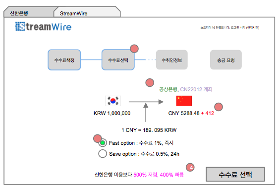
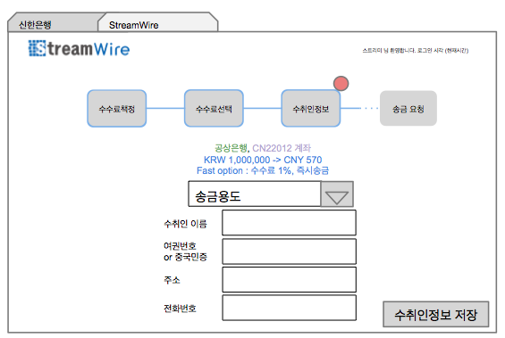
To fix the problems, I did an extensive interview with the team to understand what the original UI sought to achieve and evaluate whether the goals were valid. Based on the insights I gained, I redesigned the product so that 1) the product clearly communicates to users and 2) the product does a better job at helping the users’ decision process. For example, Streami offers two fee options: 1) fast option where payment is sent immediately and users pay 1% of the payment amount 2) slow option where payment is sent in 24 hours and users pay 0.5 % of the payment amount. In the original design, users were not able to see how much the fee exactly is given their payment amount until they click on each option. Users were also not able to see how each option compares to regular international money transfer methods (i.e., how cheaper and faster each option is than using banks) until they click on the option. However, presenting both pieces of information before users choose the options allows users to more easily compare the options. So I designed the screens so that users can view the information without having to choose the options first.
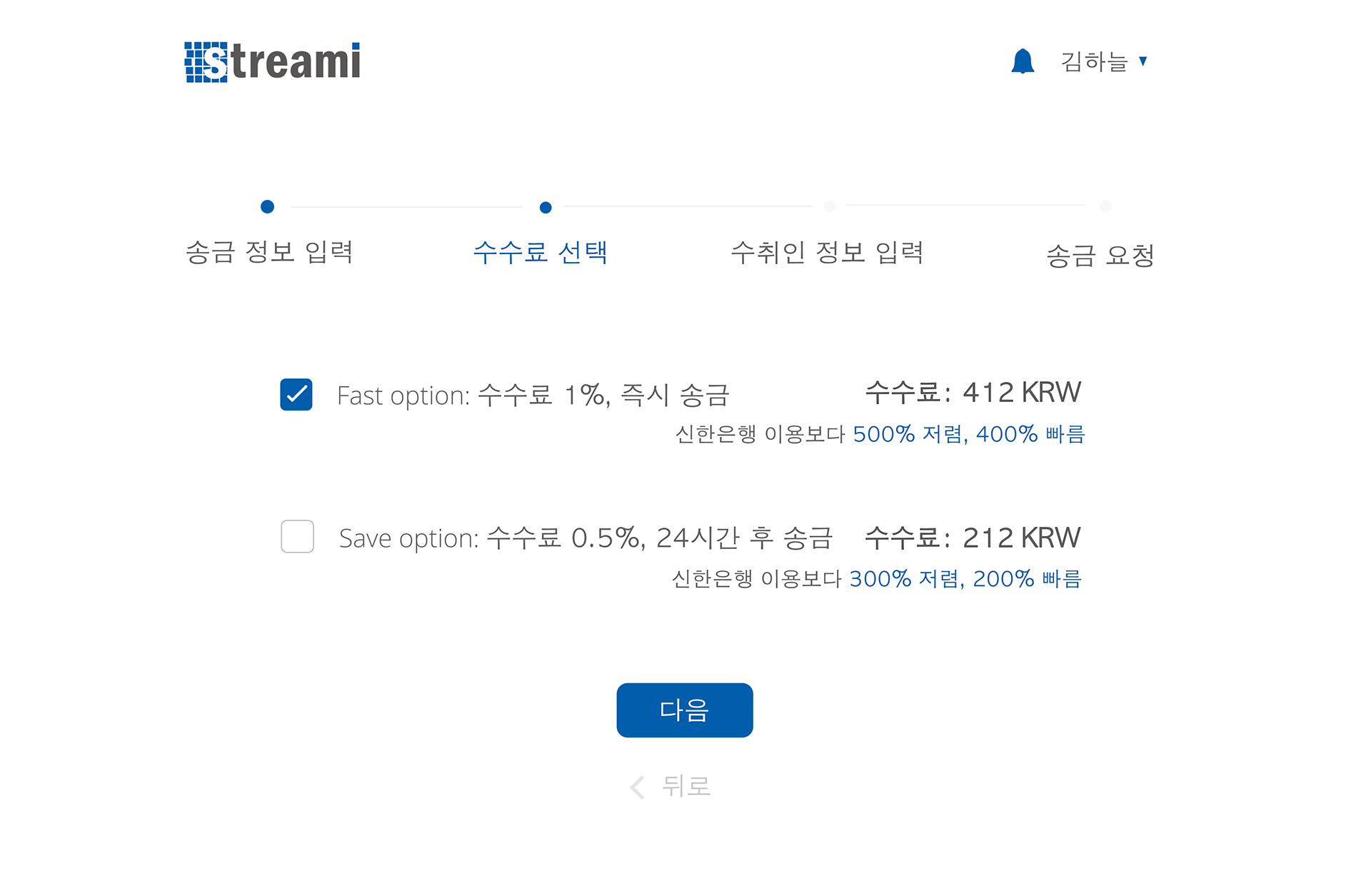
The new design allows users to more easily compare the options.
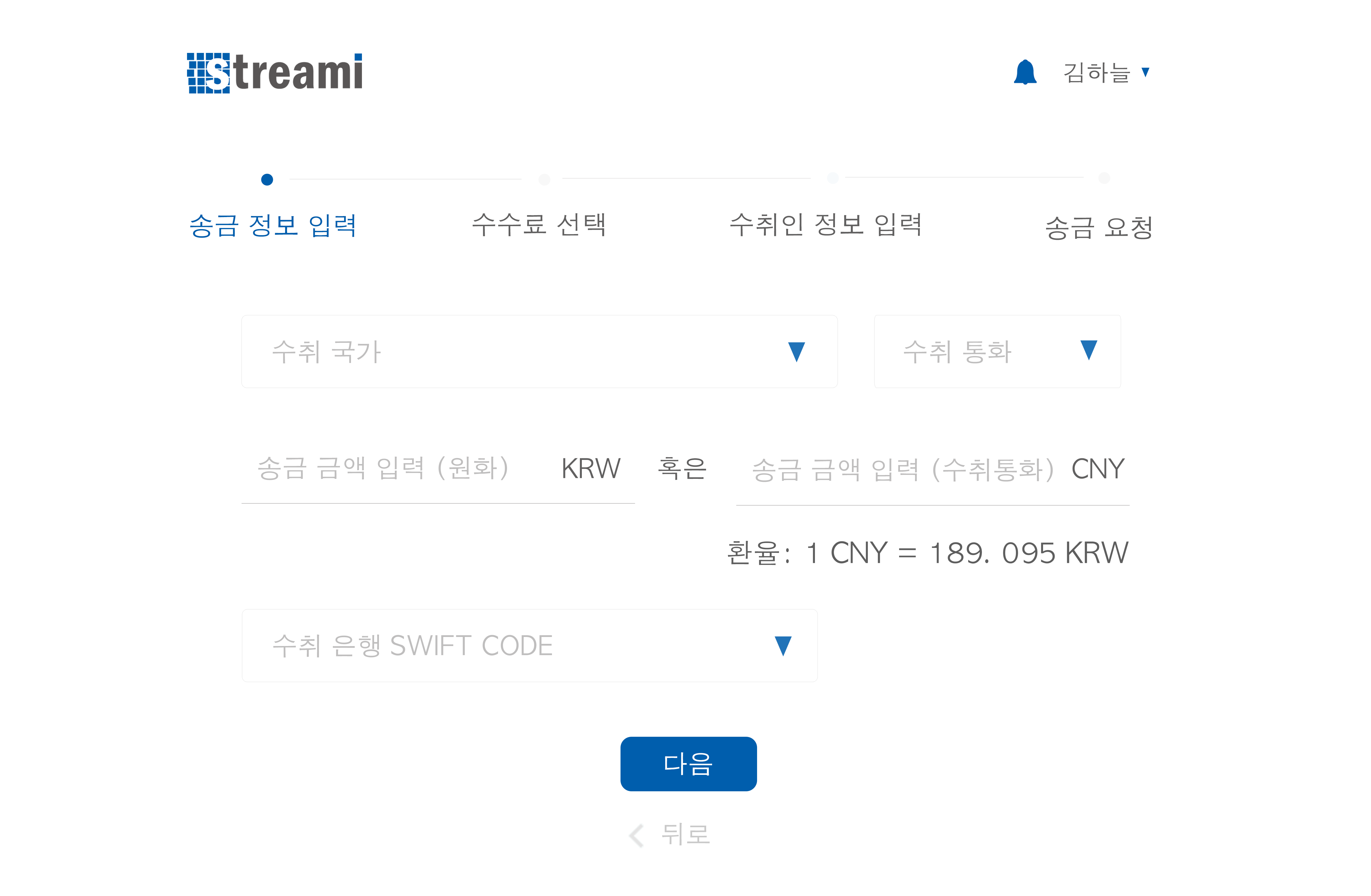
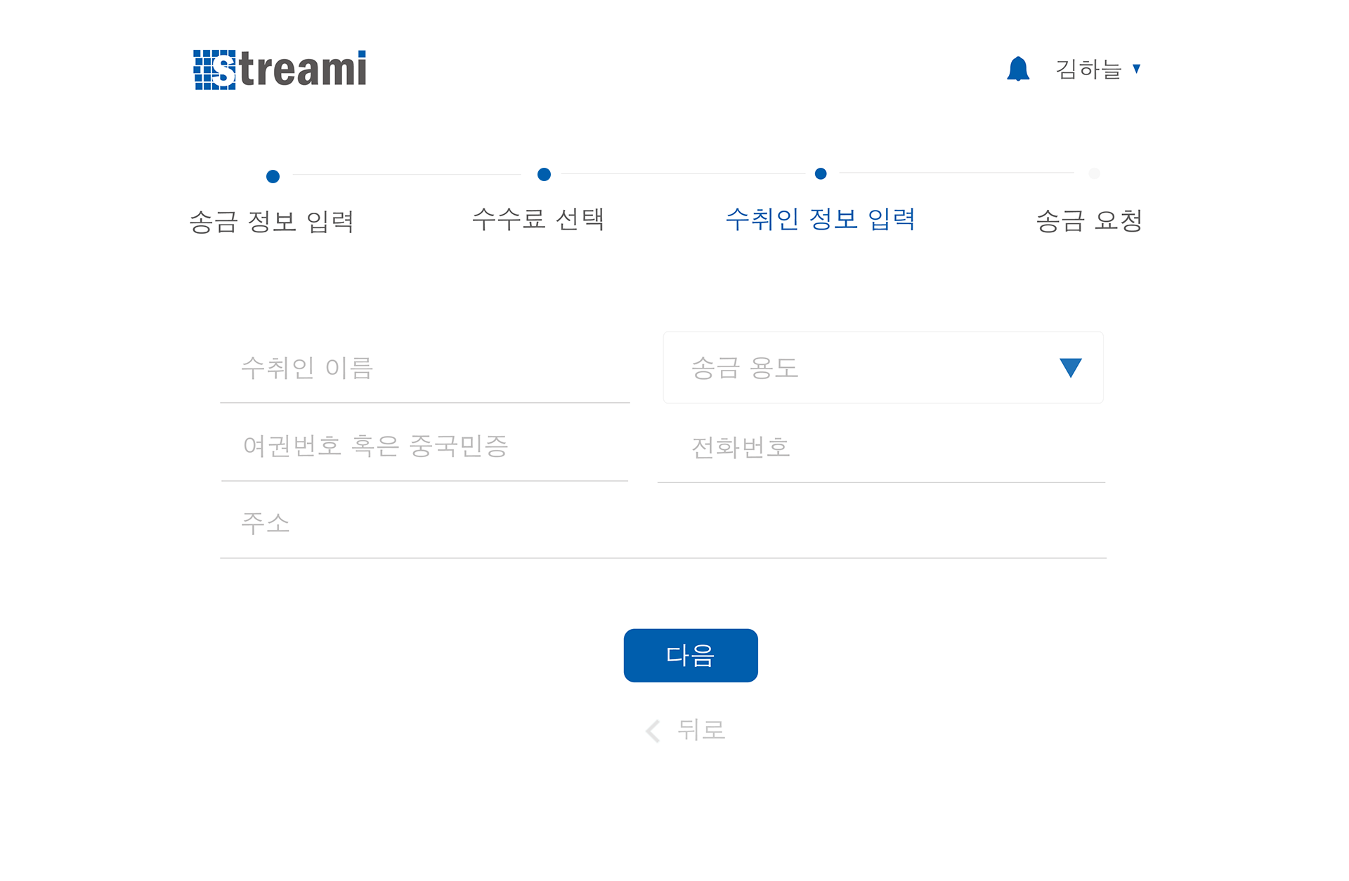
Lastly, I worked on visual design to make things look cleaner and more aesthetically appealing. Here are the final screens.