The Challenge
I designed the web and mobile UX/UI for a product that allows government-based animal shelters to track animal-related law enforcement work they did in the community. The key design challenge was to make things mobile-friendly—the product is intended to help officers work more efficiently while doing fieldwork, so it was extremely important that the mobile product help them achieve their goals easily and efficiently. Tackling this design challenge started with developing a deep empathy with the people I was designing for. Based on the insights I gained, I prototyped ideas and eventually arrived at final solutions that catered to their needs.
User Needs
Research has revealed that no existing software solution truly fulfilled target users’ needs. Among other things, users were frustrated that products were often inaccessible in the field and that it was difficult to view their own assigned items and track them. To create a truly innovative product, I developed a full understanding of users’ goals and pain points. Key insights were: 1) Users need real-time and easy access for viewing, editing, and creating new activities/cases. 2) Certain information (such as priority level) is critical and needs to be easily accessible.Final Designs

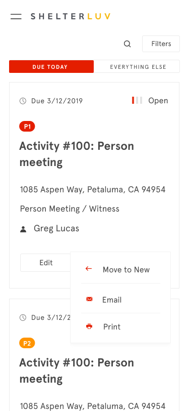
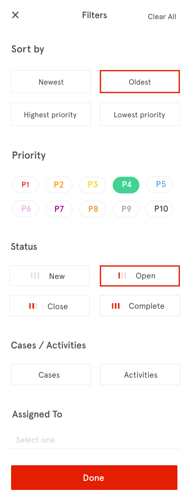
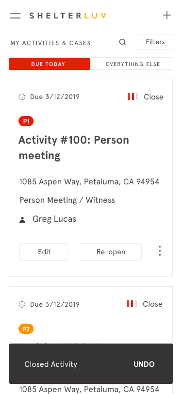
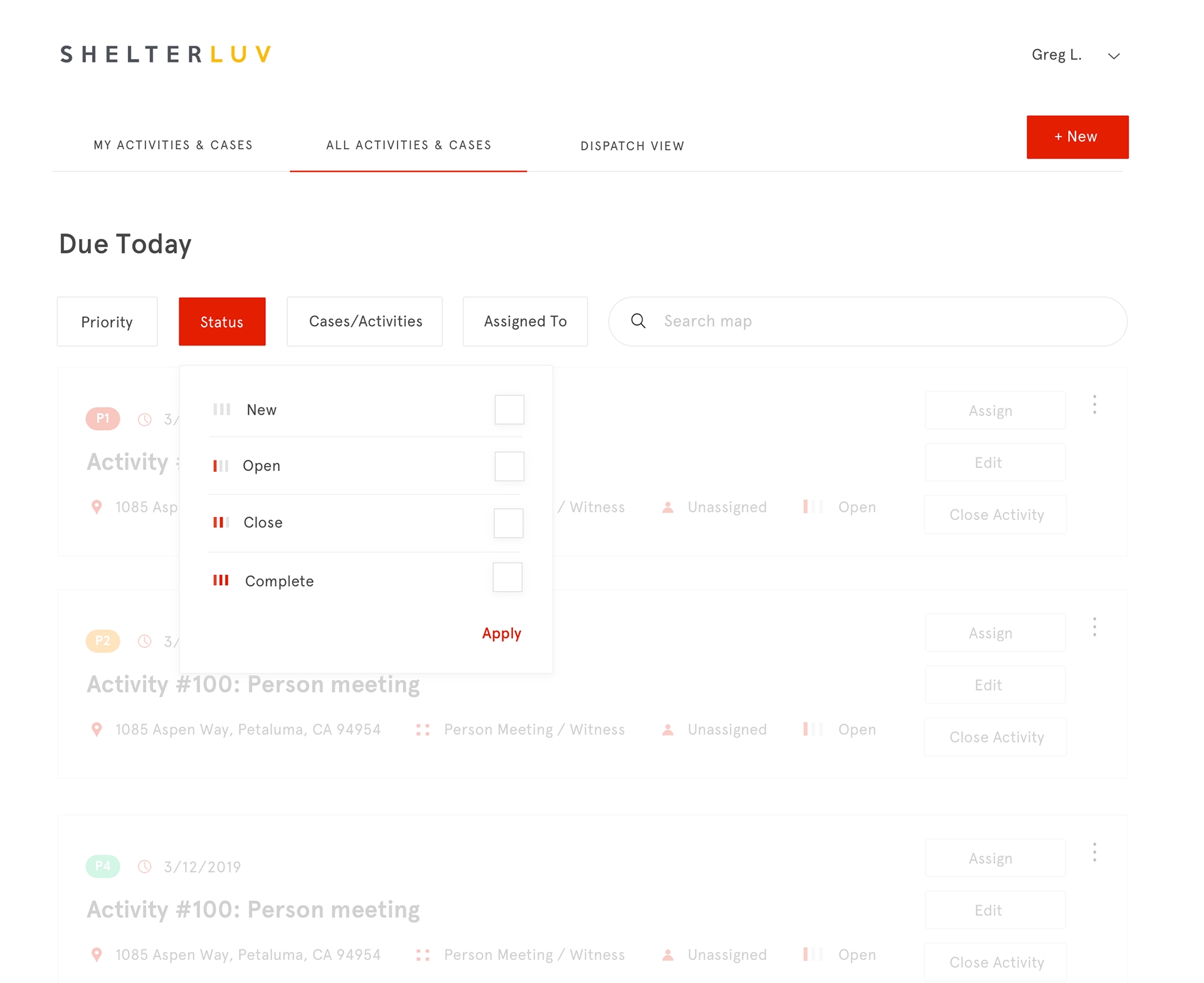
Once users log in, they have immediate access to their own to-do list arranged in order of priority. By making the to-do list front and center, I’ve enabled the product to become a true part of and enhance user workflow. In addition, based on the insight that an item’s priority and status information are crucial pieces of information that determine whether/when users work on that item, I’ve made those pieces of information visually prominent (i.e., clear, large labels for priority information and a custom mini-progress bar for status information) so that users can easily scan the list for the information.
Users also have real-time access to newly assigned items, which are made prominent visually using colors and an icon. This allows users to easily take note of and take action on those items. Moreover, the product makes it very easy to take action on items. There’s a clear section for action buttons at the bottom, and only key action buttons (i.e., Edit and Change Status buttons) are exposed, with the rest hidden under the More icon. Furthermore, the buttons are contextual—for example, when an item’s status is “New,” the button reads Open Activity (or Case) and when it’s “Open,” the button reads Close Activity (or Case). This contextuality lightens users’ cognitive load by making it very clear to them what actions they’re about to take.
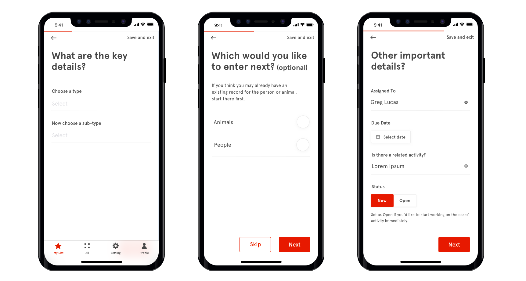
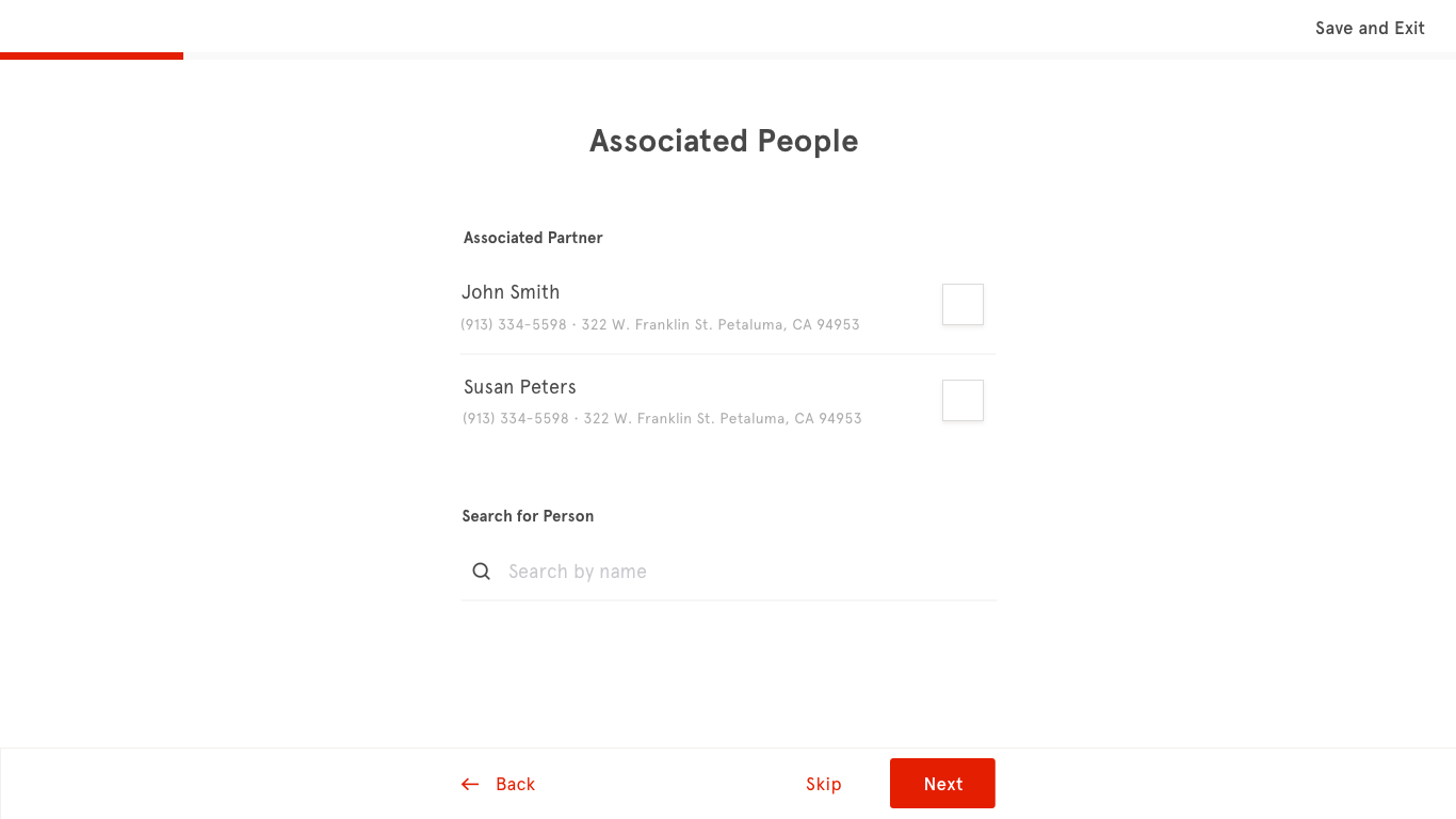
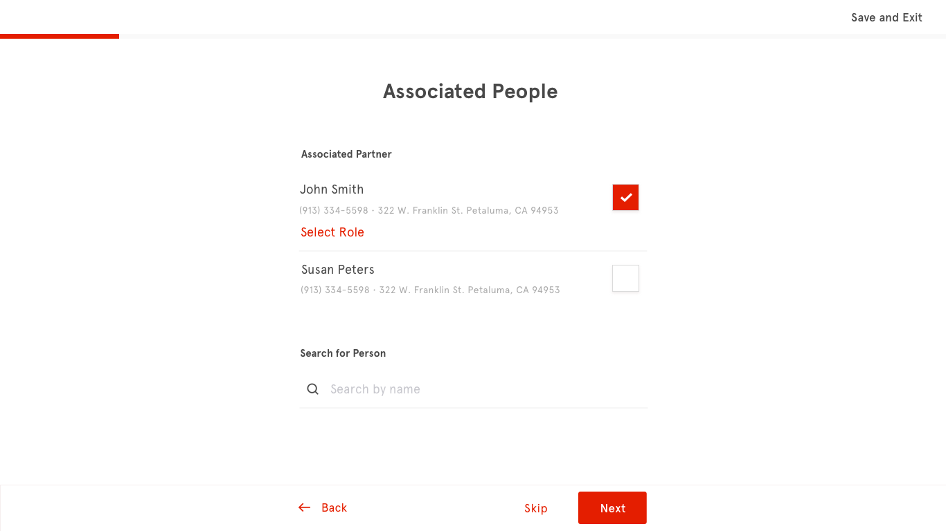
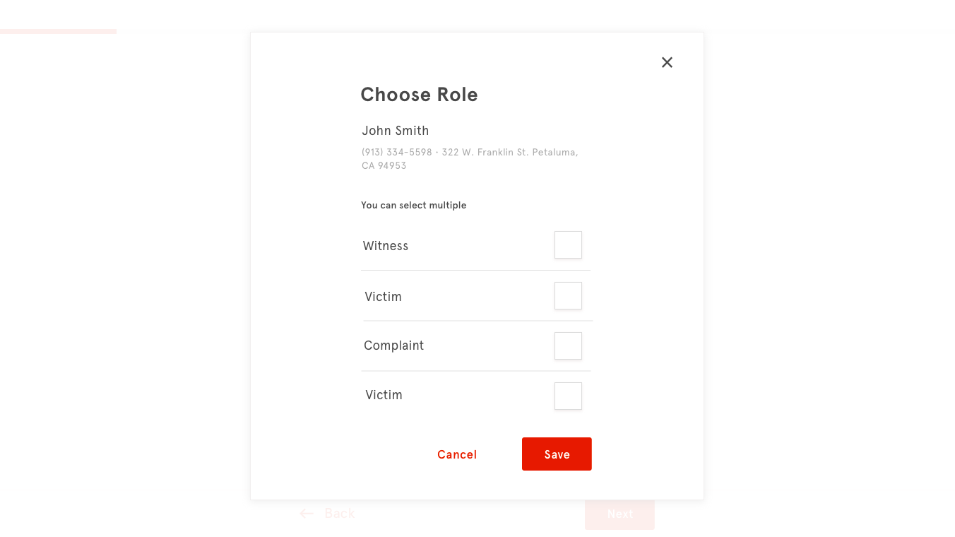
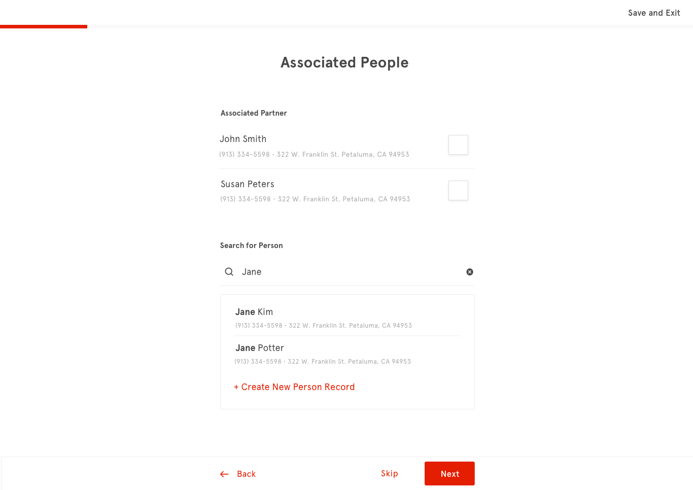
Users can very easily create new items. In addition to breaking down a long process into multiple small steps, the form guides users along by being conversational in its headings. It also utilizes tools like auto-fills and pickers wherever possible.
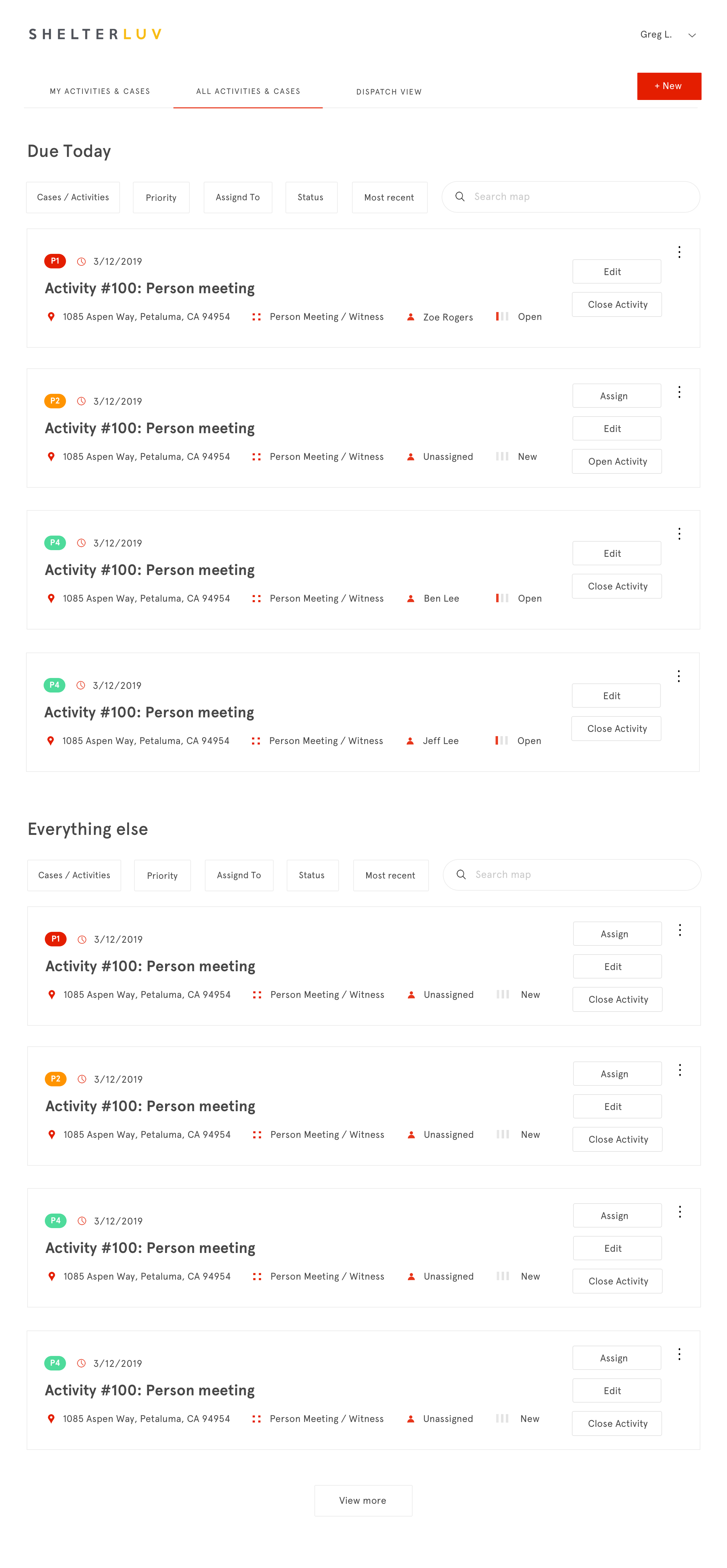
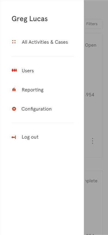
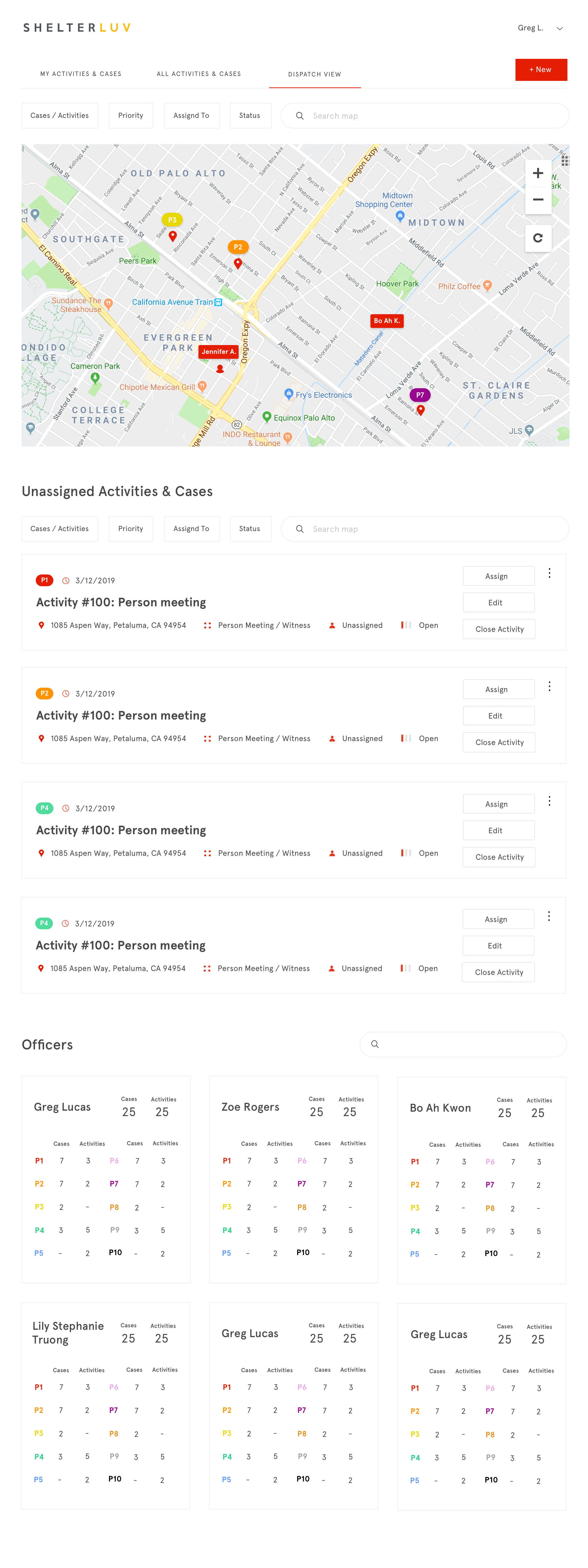
In the desktop version, less emphasis is put on making an individual officer’s to-do list prominent and users can easily check out other officers’ assigned items. This makes sense because desktop users are often dispatch teams that assign items to officers.
Here’re more screens from the project:
