The Challenge
I designed a website mockup for ClearEar, a medical device startup. ClearEar offers products that provide people a better way to clean their ears.
My Process
I like to start projects by spending time understanding the product and company. ClearEar had just run a very successful Indiegogo campaign, so I closely reviewed the campaign as well as a TechCrunch article that covered the campaign.
I then invest a lot of time into researching examples. In this case, I went onto Angelist and searched for medical device startups. I then visited their websites and studied what distinguishes well-designed websites from mediocre ones.
One insight I gained was that well-designed websites employ effective calls to action. The goal of medical device startups’ websites is to sell their products, and one way to achieve the goal is to employ effective calls to action. I observed that effective websites do this by:
1) featuring a call to action (i.e., “Order now” or “Pre-order now” button) prominently on the landing page 2) having a call to action button stay on the page as users scroll down i.e. a fixed top navigation bar that has the button stay on the page.
Another insight I gained was that effective websites feature a succinct product copy on the landing page. This makes sense because people are not interested in reading verbose product descriptions; a short, interesting product copy will pique their interest and make them want to learn more.
In addition, well-designed websites do a superb job at “storytelling” their product. They present a well-crafted story around the product that helps people understand and appreciate the product’s value.
Lastly, well-designed websites improve credibility by featuring logos of press that covered their products.
After I research examples and gain insights, I then work on content. In this case, I designed pages so they featured prominent calls to action. In addition, after brainstorming, I came up with a succinct product copy “A better way to clean your ears.” In terms of product storytelling, I decided to work with content they used in their Indiegogo campaign. The campaign earned the support of 1,276 backers, so I trusted that the content resonated with the audience. I also assembled press logos. While I saw that some websites feature press logos on the bottom of landing pages, I decided to feature them on top since ClearEar is a young company that has much to benefit from credibility cues. Credibility cues such as press coverage will instill confidence in their audience that the product is legitimate and make them feel comfortable about making a purchase.
Finally, I work on visual design and bring content to life. The company already had branding assets such as a logo and icons, so I designed pages in a style that suits their current branding.
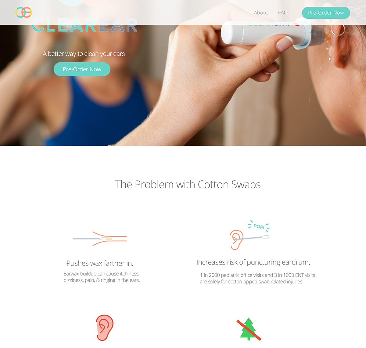
Here is the landing page.

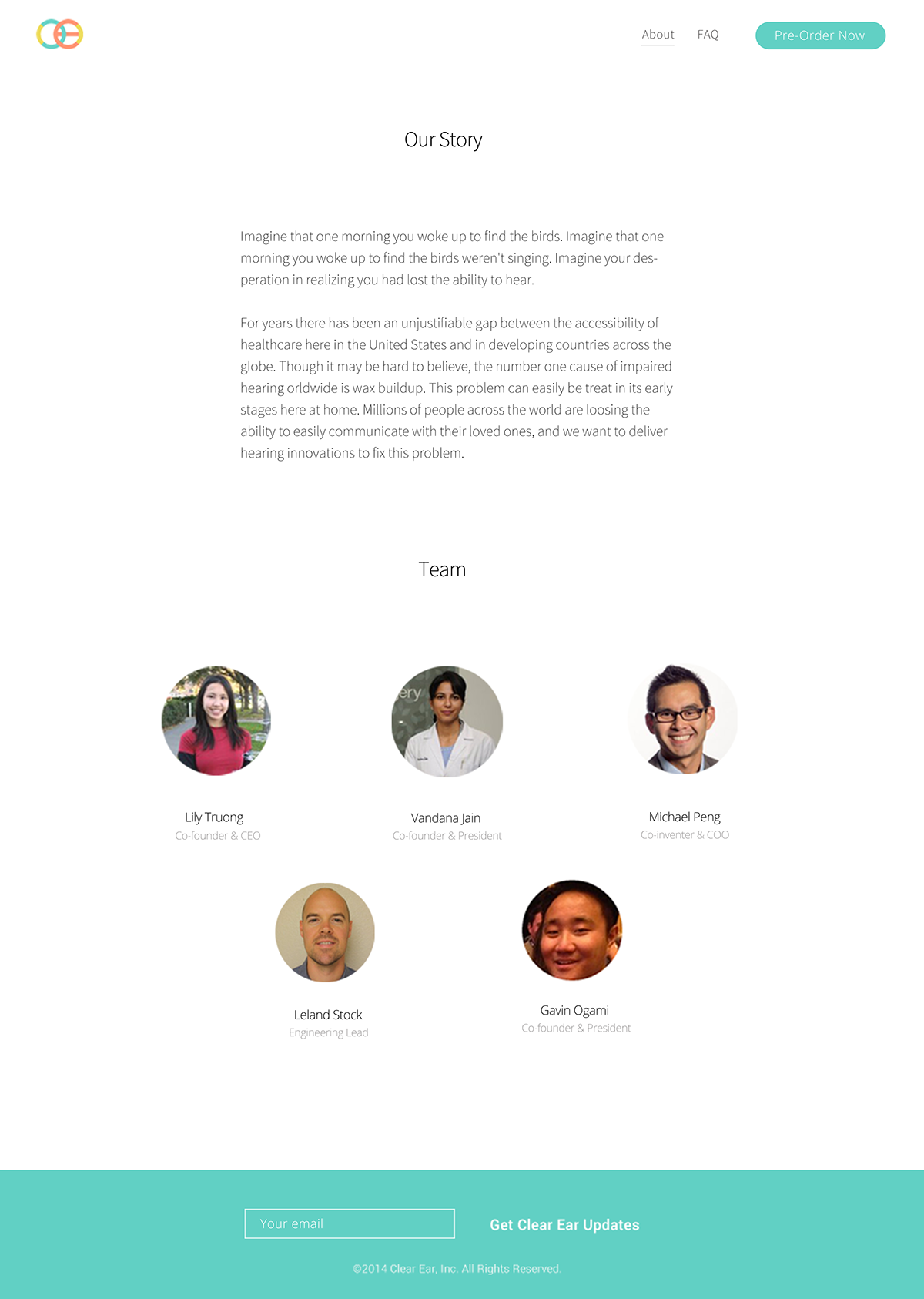
Here is the about page.

Here is the landing page with the top navigation bar shown.
